South Koreans earn, on average, $33,140 per year (PPP), making them almost as rich as Britons. However, Koreans also work 30% more hours than Britons, making their per-hour wage considerably less than a British wage. In fact, the Korean wage of $15 per hour (PPP) is comparable to that of a Czech or Slovakian.
Here is a map of the working hours of mostly OECD countries.
Hours worked per week
As you can see, people in developing countries have to work longer hours. The exception is South Korea, which works pretty hard for a rich country – harder than Brazil and Poland do. If you divide per-capita income by working hours, you get a person’s hourly wage:
World Wide Wage
The top 10 earners by wage are mostly northern Europeans – Norway, Germany, Denmark, Sweden, Switzerland, Netherlands – and small financial centres Singapore and Luxembourg. As the first to industrialize, Europeans found they were able to mechanize ploughing, assembling and number-crunching – boosting incomes, while simultaneously decreasing working hours.
The bottom earners are developing countries – such as Mexico, Brazil and Poland. Again, Korea stands out as a rich country with low wages. This could be because Korea exported their way into prosperity by winning over Western consumers from the likes of General Motors and General Electric. They did this by combining industrialization with low wages, which are therefore responsible for the ascent of their economies.
Data from World Bank, OECD, and BBC. Maps created on R.
On the 18th of September 2014, Scottish people will vote on secession from the United Kingdom, potentially ending a union that has existed since 1707. If Scots vote “Yes” to end the union, the United Kingdom will consist of England, Wales and Northern Ireland, while the newly created country of Scotland may look like this:
Basically, Scotland would look a lot like Finland. The two countries have similar populations, GDP, and even their respective largest cities are about the same size.
I got an email from a gentlemen boasting labor data that even the Bureau of Labor Statistics hasn’t published yet!
Retale, a tool that helps you scour advertisements for deals in your area, has produced a cool infograph on what Americans are doing right now. It tells you what activities Americans are doing at different times of the day: at 9PM, 34% of Americans are watching TV, 7% are still working, etc…
The data is pretty reliable, as it is from the Bureau of Labor Statistics. You can even break down the graphs into various demographics: men, women, 45-54 year olds, retirees….
Even though I am not American, the model predicts correctly that I am watching TV right now. The TV is on in the background as I type this, so close enough.
India conducted general elections between 7th April and 12th May , which elected a Member of Parliament to represent each of the 543 constituencies that make up the country.
The opposition BJP won 31% of the votes, which yielded them 282 out of 543 seats in parliament, or 52% of all seats. The BJP allied with smaller parties, such as the Telugu Desam Party, to form the National Democratic Alliance (NDA). Altogether, the NDA won 39% of the votes and 336 seats (62%).
India’s parties, topped up by their allies
Turnout was pretty good: 541 million Indians, or 66% of the total vote bank, participated in the polls.
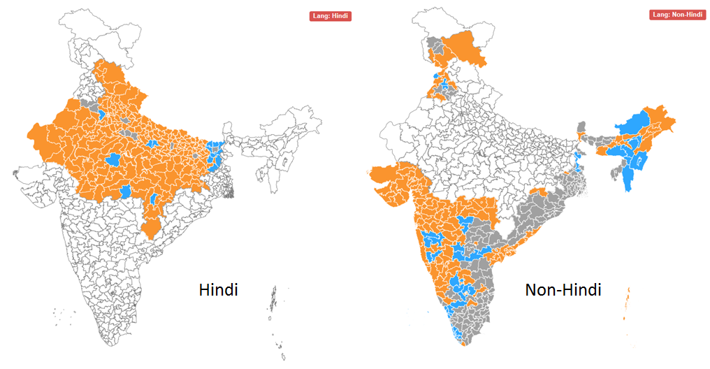
Google and Bing both performed excellent analytics on the election results, but I thought Bing’s was easier to use since their visual is a clean and simple India-only map. They actually out-simpled Google this time.
Bing: A constituency is more likely to elect BJP (orange) if its people speak Hindi
Interestingly, the BJP’s victories seem to come largely from Hindi speakers, traditionally concentrated in the north and west parts of India. Plenty of non-Hindi speakers voted for the BJP too, such as in Gujarat and Maharashtra, but votes in south and east of the country generally went to a more diverse pantheon of parties.
What is a chi-square test: A chi square tests the relationship between two attributes. Suppose we suspect that rural Americans tended to vote Romney, and urban Americans tended to vote Obama. In this case, we suspect a relationship between where you live and whom you vote for.
The full name for this test is Pearson’s Chi-Square Test for Independence, named after Carl Pearson, the founder of modern Statistics.
How to do it:
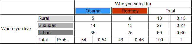
We will use a fictitious poll conducted of 100 people. Each person was asked where they live and whom they voted for.
Draw a chi-square table. .
Each row will be whom you voted for, giving us two columns for Obama and Romney. Each row will be where you live, giving us three rows – rural, suburban and urban.
Calculate totals for each row and column. .
The purpose of the first column total is to find out how many votes Obama got from all areas. Similarly, the purpose of the first row total is to find out how rural votes were cast for either candidate.
Calculate probabilities for each row and column. .
These will be the individual probabilities of voting Obama, voting Romney, living in the country, etc… For example, the Obama column total tells us that 54 out of 100 people polled voted Obama, so probability of voting Obama is 0.54.
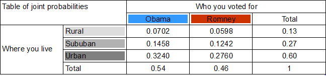
Calculate the joint probabilities of belonging to each category. . For example, probability of being rural and an Obama voter is found by multiplying the probability of voting Obama (0.54) with the probability of living in the country (0.13). So, 0.54 x 0.13 = A person has a 0.0702 chance of being a rural Obama voter. . In doing so, we assume that where you live and whom you voted for are independent. This assumption, called the null hypothesis, may well be wrong , and we will test it later by testing the joint probabilities it yielded.
Based on these joint probabilities, how many people do we expect to belong to each category? .
We multiply the joint probability for each category by 100, the number of people.
These expected numbers are based on the assumption (hypothesis) that whom you voted for and where you live are independent. We can test this hypothesis by holding these expected numbers against the actual numbers we have. . First, we need our chi-square value . . .
Basically, the equation asks that, for each category, you find the discrepancy between the observed number and expected number , square it, and then divide it by the expected number . Finally, add up the figures for each category. .
I got 0.769 as my chi-square value. .
Look at a chi-square table. .
Note that out degrees of freedom in a chi square test is . In our case, with 3 rows and 2 columns, we get 2 degrees of freedom. .
For a 0.05 level of significance and 2 degrees of freedom, we get a threshold (minimum) chi-square value of 5.991. Since our chi-square value 0.769 is smaller than the minimum, we cannot reject the null hypothesis that where you live and who you voted for are independent.
That is the end of the chi square test for independence.
Recently, Greg Laughlin, the founder of a new statistical software called Statwing, let me try his product for free. I happen to like free things very much (the college student is strong within me) so I gave it a try.
I mostly like how easy it is to use: For instance, to relate two attributes like Age and Income, you click Age, click Income, and click Relate.
So what can Statwing do?
Summarize an attribute (like “age”): totals, averages, standard deviation, confidence intervals, percentiles, visual graphs like the one below
Relate two columns together (“Openness” vs “Extraversion”)
Plots the two attributes against eachother to see how they relate. It will include the formula of the regression line and the R-squared value.
Sometimes a chi-square-style table is more appropriate. The software determines how best to represent the data.
Tests the null hypothesis that the attributes are independent, by a T-test, F-test (ANOVA) or chi-square test. Statwing determines which one is appropriate.
Repeat the above for a ranked correlation.
For now, you can’t forecast a time series or represent data on maps. But Greg told me that the team is adding new features as I type this.
If you’d like to try the software yourself, click here. They’ve got three sample datasets to play with:
Titanic passengers information
The results of a psychological survey
A list of congressman, their voting record and donations.
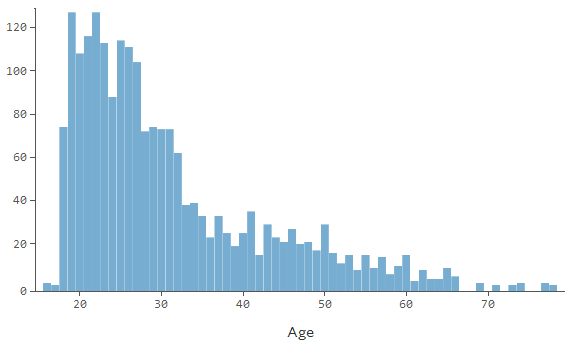
In my experience, central London is generally a safe place, but I was robbed there two years ago. A friend and I got lost on our way to a pancake house (serving, not made of), so I took my new iPhone out to consult a map. In a flash, a bicyclist zoomed past and plucked my phone out of my hands. Needless to say, I lost my appetite for pancakes that day.
But I am far from alone. Here, I have plotted 506 instances of theft, violence, arson, drug trade, and anti-social behaviour onto a map of London. The data I am using only lists crimes in the City of London, a small area within central London which hosts the global HQs of many banks and law firms, for the month of February 2014.
Crime in the City of London – February 2014
Each point on this map is not a single instance of crime – recall that the data lists over 500 instances of crime. So, each point corresponds to multiple instances of crime which happened at a particular spot. So, it is probably best to split the map into hexagons (no particular reason for my choice of shape) which are colour coded to explain how dense the crime in that area is.
Heatmap of crime in Central London – Feb 2014
A particular hotspot for crime appears to be the area around the Gherkin, or 30 St Mary’s Axe, Britain’s most expensive office building.
Data from data.police.uk; Graphics produced on R using ggplot2 package; Map from Google maps.
For all the flak China receives about its greenhouse gas emissions, the average Chinese produces less than a third the amount of CO2 than his American counterpart. It just so happens that there are 1.3 billion Chinese, and 0.3 billion Americans, so China ends up producing more CO2.
Carbon dioxide and other greenhouse gases, such as methane and carbon monoxide, are produced from burning petrol, growing rice, and raising cattle . These greenhouse gases let in sun rays, but do not let out the heat that the rays generate on earth. This results in a greenhouse effect, where global temperatures are purported to be rising as a result of human activities.
The below map shows the per-capita emissions of greenhouse gases:
As you can see, the least damage is done by people in Africa, South Asia, and Latin America. But these places also happen to be the poorest places:…
The Current Account Balance is a measure of a country’s “profitability”. It is the sum of profits (losses) made from trading with other countries, profits (losses) made from investments in other countries, and cash transfers, such as remittances from expatriates.
As the infographic shows, there isn’t much middle ground when it comes to a current account balance. Most countries have:
large deficits (America, most of Europe, Australia, Brazil, India)
large surpluses (China, most of Southeast Asia, Northern European countries, Russia, Gulf oil producers).
There are a few countries with
small deficits (most Central American states, Pakistan)
small surpluses (most Baltics)
…but they are largely outnumbered by the clear winners and losers of world trade.
The above is not a per-capita infographic, so larger countries tend to be clear winners or losers, while smaller countries are more likely to straddle the divide. Here is the per-capita Current Account Balance map:
Say you have a dataset, where each row has a date or time, and something is recorded for that date and time. If each row is a unique date – great! If not, you may have rows with the same date, and you have to combine records for the same date to get a daily tally.
Here is how you can make a daily tally (or a monthly or yearly one; the frequency of tallies is not important):
convert the dates to numbers. R will say 01/01/1970 is day 1, 02/01/1970 is day 2, …, 07/03/2010 is day 14675; 31/12/1960 is day -1.
use a “for loop” to lump entries from the same date together
calculate the daily by calculating the number of rows in the daily lump (I do this below), or by adding all entries in a particular column in a daily lump
for(i in 1:184) #my data spans 184 days from 7th March to 6th Sept 2010
{
rott.i<-rott[rott[,2]==14674+i,] daily[i,1]<-nrow(rott.i) #7th March 2010 is the 14675th day from 01/01/1970, the day the R calendar starts
}
acf(daily,main=”Autocorrelation of Timeseries”) #ACF!
I have a standard code for ggplot2 which I use to make line graphs, scatter plots, and histograms.
For lines or scatters:
p<- ggplot(x, aes(x=Year, y=Rank, colour=Uni, group=Uni)) #colour lines by variable Uni #group Uni labelled variables in the same line
Then:
p + #you get an error if not for this step
geom_line(size=1.2) +
geom_point(data=QS[QS[,2]==”2013″,]) +
geom_text(data=QS[QS[,2]==”2013″&QS[,1]!=”Princeton”,],aes(label=paste(paste(Rank,”.”,sep=””),Uni)),hjust=-0.2)+
ylim(17,0.5) +
scale_x_continuous(limit=c(2004,2014),breaks=seq(2004,2014,1)) +
theme(legend.position=”none”) +
ggtitle(“QS University Rankings 2008-2013”) +
theme(plot.title=element_text(size=rel(1.5))) +
theme_bw() +
theme(panel.grid.major=element_blank(), panel.grid.minor=element_blank()) +
geom_text(aes(label=country),size=6,vjust=-1) +
annotate(“text”,x=2011,y=16.5,label=”Abbas Keshvani”)
For all the flak China receives about its greenhouse gas emissions, the average Chinese produces less than a third the amount of CO2 than his American counterpart. It just so happens that there are 1.3 billion Chinese, and 0.3 billion Americans, so China ends up producing more CO2.
Carbon dioxide and other greenhouse gases, such as methane and carbon monoxide, are produced from burning petrol, growing rice, and raising cattle . These greenhouse gases let in sun rays, but do not let out the heat that the rays generate on earth. This results in a greenhouse effect, where global temperatures are purported to be rising as a result of human activities.
The below map shows the per-capita emissions of greenhouse gases:
Greenhouse Gas Emissions per capita
As you can see, the least damage is done by people in Africa, South Asia, and Latin America. But these places also happen to be the poorest places: Because they don’t have much industry, they don’t churn out much CO2.
The below plot shows the correlation between poverty and green-ness. As you can see, each dollar of a rich person is attached to a smaller carbon cost than the dollar of a poor person. This is partially because rich people get most of their manufacturing done by poor people, but also because rich people are more environmentally conscious.
Plot: CO2 per Dollar vs. GDP per capita
Lastly, here is a map of CO2 emissions per dollar of GDP, which shows how green different economies are:
CO2 Emissions per Dollar
CO2 emissions per Dollar of output are lowest in:
EU and Japan: highly regulated and environmentally conscious
sub-Saharan Africa: subsistence-based economies
…and highest in the industrializing economies of Asia.
Kudos to Brazilian output for being so green, despite the country’s middle-income status. Were these statistics to factor in the CO2 absorption from rainforests, Brazil and other equatorial countries would appear even greener.
The QS Rankings are an influential score sheet of universities around the world. They are published annually by Quacquarelli Symonds (QS), a British research company based in London. The rankings for 2013 are out, and I have charted the rankings of this year’s top 10 over the last five years:
QS’s top 10 from 2008 to 2013; The label is the 2013 rank. Columbia is included because it was in the top 10 of 2008 and 2010.
Observations from this year’s ranking:
MIT (#1 in 2013) has shot up in the rankings. This is in line with the increasing demand for technical and computer science education. At Harvard, enrollment into the college’s introductory computer science course went up, from around 300 students in 2008 to almost 800 students in 2013!
Asia’s top scorer is National University of Singapore
Method:
Method: How QS Ranks Universities
The QS Rankings produce an aggregate score, on a scale of 0-100, for each university. The aggregate score is a sum of six weighted scores:
Academic reputation: from a global survey of 62,000 academics (40%)
Student:Faculty ratio (20%)
Citations per Faculty: How many times the university’s research is cited in other sources on Scopus, a database of research (20%)
Employer reputation: from a global survey of 28,000 employers (20%)
Int’l Faculty (Students): proportion of faculty (students) from abroad (5% each)
Note that many of the universities are apart by tiny numbers (MIT, Harvard, Cambridge, UCL, Imperial are all within 1.3 points of each other), which increases the likelihood of bias or error influencing the ranking.
In any case, it appears futile to try and compare massive multi-disciplinary institutions by a single statistic.
However, larger trends – like MIT’s and Stanford’s ascendancy – are noteworthy.
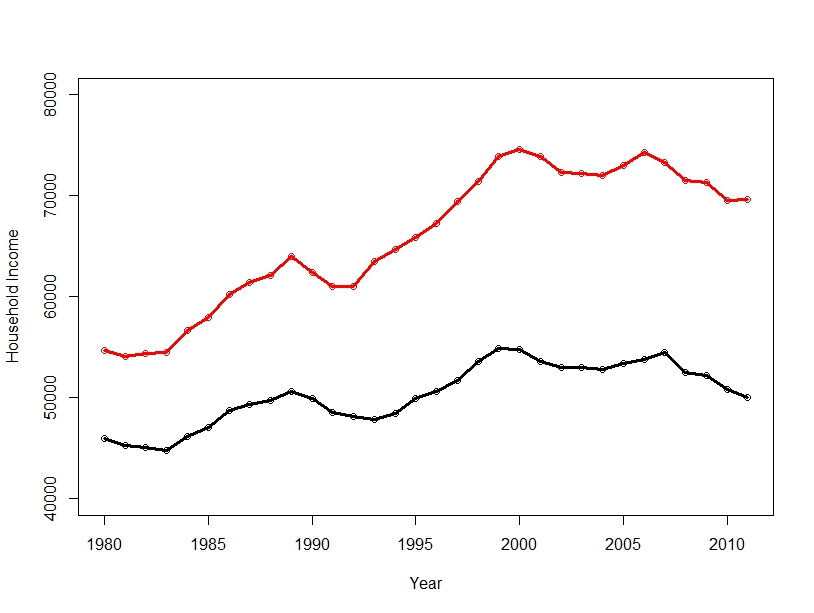
In America, the richest 1% of households earned almost 20% of the income in 2012, which points to a very wide income gap. This presents many social and economic problems, but also a statistical problem: what is the “average” American’s salary?
This average is often reported as GDP per capita: the mean of household incomes. In 2011, the mean household earned $70,000. However, the majority of Americans earned well below $70K that year. The reason for this misrepresentation is rich people: In 2011, Oracle CEO Larry Ellison made almost $100 million, alone adding a dollar to each household’s income, were his salary distributed among everyone – as indeed the mean makes it appear it is.
Here is a graphic of American inequity:
Income Distribution in America: the blue part of the last bar represents the earnings of the top 5% of households
As you can see, the mean would not be such a poor representation (or rich representation) of the average salary if we discounted the top 5%.
In fact, the trimmed mean removes extreme values before calculating the mean. Unfortunately, the trimmed mean is not widely used in data reporting by the agencies that report incomes – the IRS, Bureau of Economic Analysis and the US Census.
In this case, the median is a much better average. This is simply the income right in the middle of the list of incomes.
American Household Income: the Mean is much higher than the Median
As you can see, whether you use the Mean or Median makes a very big difference. The median household income is $20,000 lower than the mean household income.
Of course, America is not the only country with a wide economic divide. China, Mexico and Malaysia have similar disparities between rich and poor, while most of South America and Southern Africa are even more polarized, as measured by the Gini coefficient, a measure of economic inequality.
Data from the US Census. Available income data typically lags by two years, which is why graphs stop at 2011; 2012 Data is projected. Graphics produced on R.
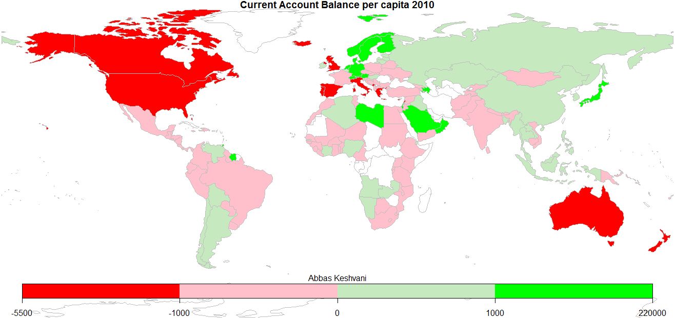
The Current Account Balance is a measure of a country’s “profitability”. It is the sum of profits (losses) made from trading with other countries, profits (losses) made from investments in other countries, and cash transfers, such as remittances from expatriates.
World: Current Account Balance, 2010
As the infographic shows, there isn’t much middle ground when it comes to a current account balance. Most countries have:
large deficits (America, most of Europe, Australia, Brazil, India)
large surpluses (China, most of Southeast Asia, Northern European countries, Russia, Gulf oil producers).
There are a few countries with
small deficits (most Central American states, Pakistan)
small surpluses (most Baltics)
…but they are largely outnumbered by the clear winners and losers of world trade.
The above is not a per-capita infographic, so larger countries tend to be clear winners or losers, while smaller countries are more likely to straddle the divide. Here is the per-capita Current Account Balance map:
World: Current Account Balance per capita, 2010
This can be interpreted as how much people around the world earn from eachother:
Anglophones (people in America, Canada, UK, Australia) chock up some of the biggest deficits, as do people in the Mediterranean
Oil producers (Saudis, Libyans, Norwegians) profit the most off trade, as do industrious Germans and Japanese. I sense an automobile theme
Most of us are somewhere in the middle
Records: Icelanders have the biggest deficits, Singaporeans the biggest surpluses
On the topic of English-speakers running deficits, here is a recent BBC article that explores the link between the English language and the act of saving money.
2010 Current Account Balance and Population data from World Bank; graphics produced on R.
There are different types of data on R. I use type here as a technical term, rather than merely a synonym of “variety”. There are three main types of data:
Numeric: ordinary numbers
Character: not treated as a number, but as a word. You cannot add two characters, even if they appear to be numerical. Characters have “inverted commas” around them.
Date: can be used in time series analysis, like a time series plot.
To diagnose the type of data you’re dealing with, use class()
You can convert data between types. To convert to:
Numeric: as.numerical()
Character: as.character()
Date: as.Date()
Note that to convert a character or numeric to a date, you may need to specify the format of the date:
ddmmyyyy: as.Date(x, format=”%d%m%Y”) *default, so format needn’t be specified
mmddyyyy: as.Date(x, format=”%m%d%Y”)
dd-mm-yyyy: as.Date(x, format=”%d-%m-%Y”)
dd/mm/yyyy: as.Date(x, format=”%d/%m/%Y”)
if the month is named, like 12February1989: as.Date(x, format=”%d%B%Y”)
if the month is short-form named, like 12Feb1989: as.Date(x, format=”%d%b%Y”)
if the year is in two digit form, like 12Feb89: as.Date(x, format=”%d%m%y”)
if the date in mmyyyy form: as.yearmon(x, format=”%m%Y”) *from zoo package
if date includes time, like 21/05/2012 21:20:30: as.Date(x, format=”%d/%m/%Y %H:%M:%S)
Suppose you have decided on a suitable model for a timeseries. In this case, we have selected an ARIMA(2,1,3) model, using the Akaike Information Criteria (AIC) as our sole criterion for choosing between various models here, where we model the DJIA.
Note: There are many criteria for choosing a model, and the AIC is only one of them. Thus, the AIC should be used heuristically, in conjunction with t-tests and the Coefficient of Determination, among other statistics. Nonetheless, let us assume that we ran all these tests, and were still satisfied with ARIMA(2,1,3).
An ARIMA(2,1,3) looks like this:
This is not very informative for forecasting future reaizations of a timeseries, because we need to know the values of the coefficients , , etcetera. So we use R’s arima() function, which spits out the following output:
ARIMA(2,1,3): Coefficients
Thus, we revise our model to:
Then, we can forecast the next, say 20, realizations of the DJIA, to produce a forecast plot. We are forecasting values for January 1st 1990 to January 26th 1990, dates for which we have the real values. So, we can overlay these values on our forecast plot:
Forecast: Predicted range (shaded in light grey for 95% confidence, dark grey for 80% confidence) and Actual Values (red)
Note that the forecast is more accurate for predicting the DJIA a few days ahead than later dates. This could be due to:
the model we use
fundamental market movements that could not be forecasted
Which is why data in a vacuum is always pleasant to work with. Next: Data in a vacuum. I will look at data from the biggest vacuum of all – space.
The Akaike Information Critera (AIC) is a widely used measure of a statistical model. It basically quantifies 1) the goodness of fit, and 2) the simplicity/parsimony, of the model into a single statistic.
When comparing two models, the one with the lower AIC is generally “better”. Now, let us apply this powerful tool in comparing various ARIMA models, often used to model time series.
The dataset we will use is the Dow Jones Industrial Average (DJIA), a stock market index that constitutes 30 of America’s biggest companies, such as Hewlett Packard and Boeing. First, let us perform a time plot of the DJIA data. This massive dataframe comprises almost 32000 records, going back to the index’s founding in 1896. There was an actual lag of 3 seconds between me calling the function and R spitting out the below graph!
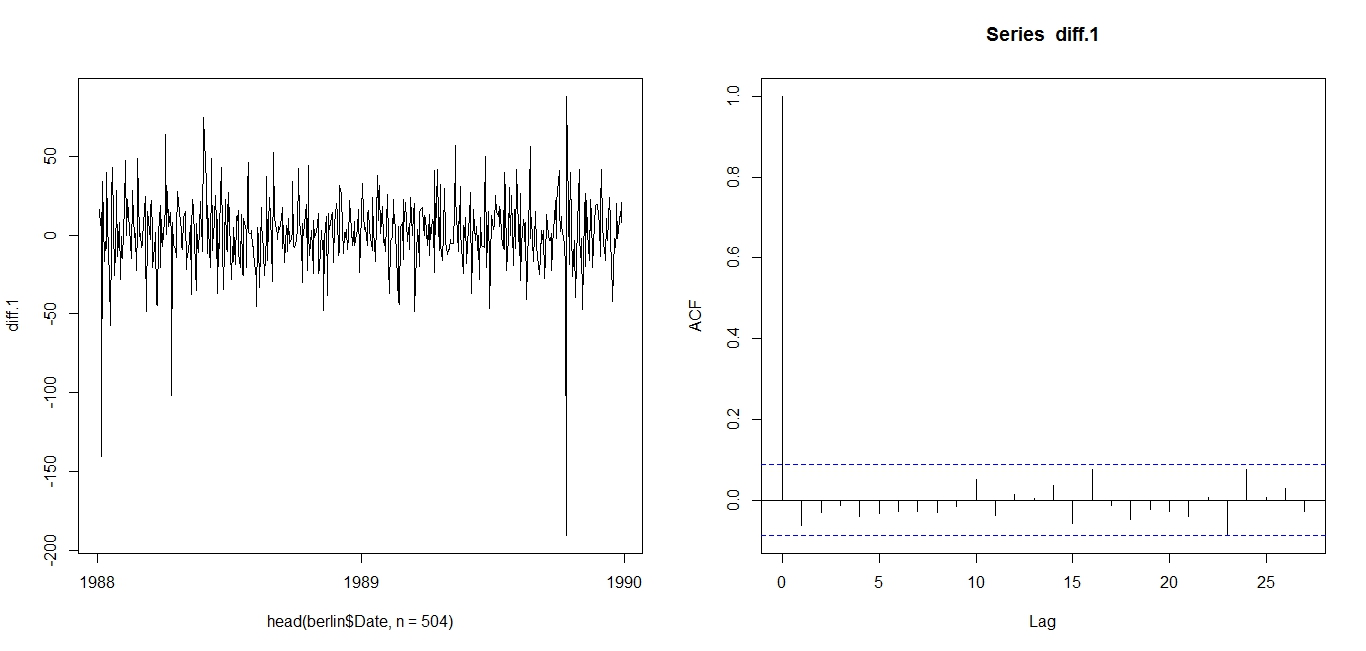
Dow Jones Industrial Average since March 1896But it immediately becomes apparent that there is a lot more at play here than an ARIMA model. Since 1896, the DJIA has seen several periods of rapid economic growth, the Great Depression, two World Wars, the Oil shock, the early 2000s recession, the current recession, etcetera. Therefore, I opted to narrow the dataset to the period 1988-1989, which saw relative stability. As is clear from the timeplot, and slow decay of the ACF, the DJIA 1988-1989 timeseries is not stationary:
Time plot (left) and AIC (right): DJIA 1988-1989So, we may want to take the first difference of the DJIA 1988-1989 index. This is expressed in the equation below:
The first difference is thus, the difference between an entry and entry preceding it. The timeseries and AIC of the First Difference are shown below. They indicate a stationary time series.
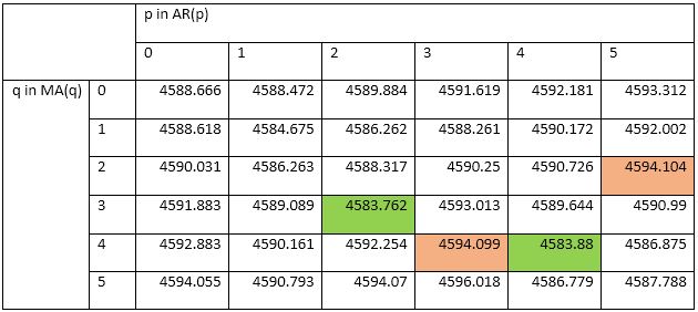
First Difference of DJIA 1988-1989: Time plot (left) and ACF (right)Now, we can test various ARMA models against the DJIA 1988-1989 First Difference. I will test 25 ARMA models: ARMA(1,1); ARMA(1,2), … , ARMA(3,3), … , ARMA(5,5). To compare these 25 models, I will use the AIC.
Table of AICs: ARMA(1,1) through ARMA(5,5)I have highlighted in green the two models with the lowest AICs. Their low AIC values suggest that these models nicely straddle the requirements of goodness-of-fit and parsimony. I have also highlighted in red the worst two models: i.e. the models with the highest AICs. Since ARMA(2,3) is the best model for the First Difference of DJIA 1988-1989, we use ARIMA(2,1,3) for DJIA 1988-1989.
The AIC works as such: Some models, such as ARIMA(3,1,3), may offer better fit than ARIMA(2,1,3), but that fit is not worth the loss in parsimony imposed by the addition of additional AR and MA lags. Similarly, models such as ARIMA(1,1,1) may be more parsimonious, but they do not explain DJIA 1988-1989 well enough to justify such an austere model.
Note that the AIC has limitations and should be used heuristically. The above is merely an illustration of how the AIC is used. Nonetheless, it suggests that between 1988 and 1989, the DJIA followed the below ARIMA(2,1,3) model:
Next: Determining the above coefficients, and forecasting the DJIA.
Analysis conducted on R. Credits to the St Louis Fed for the DJIA data.
In my previous post, I wrote about using the autocorrelation function (ACF) to determine if a timeseries is stationary. Now, let us use the ACF to determine seasonality. This is a relatively straightforward procedure.
Firstly, seasonality in a timeseries refers to predictable and recurring trends and patterns over a period of time, normally a year. An example of a seasonal timeseries is retail data, which sees spikes in sales during holiday seasons like Christmas. Another seasonal timeseries is box office data, which sees a spike in sales of movie tickets over the summer season. Yet another example is sales of Hallmark cards, which spike in February for Valentine’s Day.
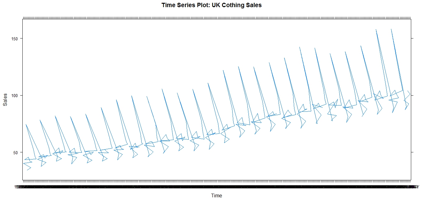
The below graphs show sales of clothing in the UK, and how these sales follow seasonal trends, spiking in the holiday season:
Clothing Sales in the UKClothing Sales in the UK: line graph
Note the spikes in sales, which obediently occur every December, in time for Christmas. This is evident in the trail of December plot points (Graph 1), which hover significantly above the sales data for other months, and also in the actual spikes of the line graph (Graph 2).
The above is a simple example of a seasonal timeseries. However, timeseries are not always simply seasonal. For example, a SARMA process comprises of seasonal, autoregressive, and moving average components, hence the acronym. This will not look as obviously seasonal, as the AR and MA processes may overlap with the seasonal process. Thus, a simple timeseries plot, as shown above, will not allow us to appreciate and identify the seasonal element in the series.
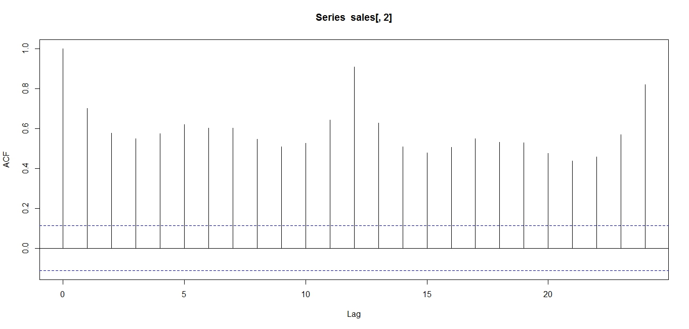
Thus, it may be advisable to use an autocorrelation function to determine seasonality. In the case of seasonality, we will observe an ACF as below:
ACF of UK clothing sales data
Note that the ACF shows an oscillation, indicative of a seasonal series. Note the peaks occur at lags of 12 months, because April 2011 correlates with April 2012, and 24 months, because April 2011 correlates with April 2013, and so on.
The above analyses were conducted on R. Credits to data.gov.uk and the Office of National Statistics, UK for the data.
The Autocorrelation function is one of the widest used tools in timeseries analysis. It is used to determine stationarity and seasonality.
Stationarity:
This refers to whether the series is “going anywhere” over time. Stationary series have a constant value over time.
Below is what a non-stationary series looks like. Note the changing mean.
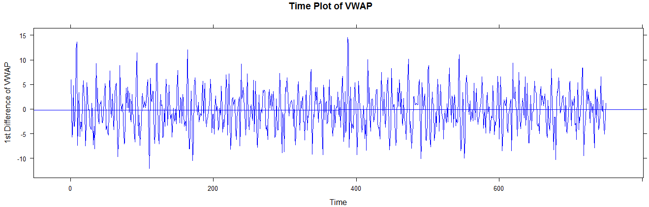
Time series plot of non-stationary seriesAnd below is what a stationary series looks like. This is the first difference of the above series, FYI. Note the constant mean (long term).
Stationary series: First difference of VWAPThe above time series provide strong indications of (non) stationary, but the ACF helps us ascertain this indication.
If a series is non-stationary (moving), its ACF may look a little like this:
ACF of non-stationary seriesThe above ACF is “decaying”, or decreasing, very slowly, and remains well above the significance range (dotted blue lines). This is indicative of a non-stationary series.
On the other hand, observe the ACF of a stationary (not going anywhere) series:
ACF of stationary seriesNote that the ACF shows exponential decay. This is indicative of a stationary series.
Consider the case of a simple stationary series, like the process shown below:
We do not expect the ACF to be above the significance range for lags 1, 2, … This is intuitively satisfactory, because the above process is purely random, and therefore whether you are looking at a lag of 1 or a lag of 20, the correlation should be theoretically zero, or at least insignificant.


 .
.
 and expected number
  , square it, and then divide it by the expected number
 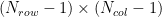 . In our case, with 3 rows and 2 columns, we get 2 degrees of freedom.
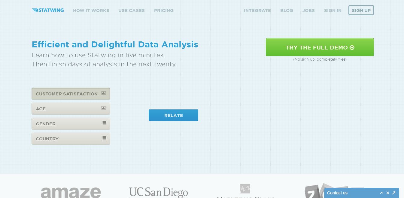


 ,
,  , etcetera. So we use R’s arima() function, which spits out the following output: