TWD: An FX whodunnit

The Taiwanese dollar (TWD) soared as much as 8% this month. This would be a colossal move for any currency, but especially for TWD, which usually moves less than 0.5% daily. Folks have been scrambling to figure out who was responsible for this spectacular rally, from exporters to life insurance companies to the central bank.

It’s the balance of payments, stupid. I type this on a laptop made in Taiwan, contributing to the island’s current account surplus of 14% of its GDP. Such a bounty would ordinarily lead to appreciation of TWD, but much of it is recycled back out by life insurance companies (“lifers”) and the central bank buying foreign assets like US Treasuries. What’s more, exporters tend to retain a lot of their proceeds in foreign currency. Altogether, the trifecta of lifers, exporters, and the central bank have been building up an epic long-dollar position for years.

Central bank started selling dollars. The trifecta holding a floor under USD/TWD began to unravel in 2024. In the first half of the year, the central bank sold $9.1 billion of FX reserves — its biggest sale yet. I estimate that since then, they have picked up the pace of selling even further to an average $2 billion per month into March this year.
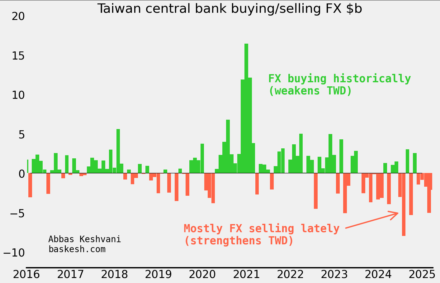
My own estimate of the central bank intervention amounts

There were clues… Around the time that the central bank began selling dollars, TWD started trading stronger than my framework1 implied (this is all before the big move recently). This outperformance of TWD indicated that the currency was experiencing a regime shift. There is a lesson here: when one’s framework starts to “break down” it is a sign that something is afoot. This discrepancy from the model foreshadowed the 15 sigma move that we saw in early May 2025.

Lifers and exporters were not the first movers… To be clear, over the period that the central bank was selling dollars, insurers were actually reducing USD/TWD hedges (i.e. selling less dollars) and exporter conversion of FX proceeds had fallen to its lowest ever rate (i.e. selling less dollars). So the CBC was the first mover in the trifecta that had been keeping TWD weak until now.
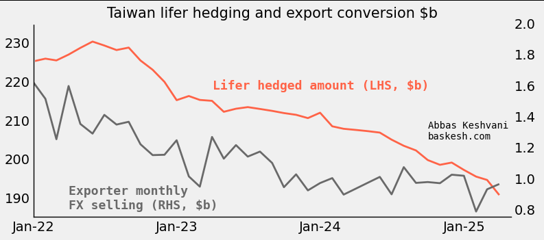
… but they must have piled in. Lifers and exporters had too large a long-dollar position to not take notice of the change at the central bank. Lifers own almost $700 billion in foreign assets, and 60% of this is FX-unhedged. Exporters were holding on to their own mega-pile of dollars. Based on TWD’s historical sensitivity to flows, I estimate that the big move in early May 2025 was enabled by a conversion of around $45 billion going through. There are few parties who can manage such a colossal flow, but lifers and exporters fit the bill.

American scrutiny. So there you have it: the trifecta propping up USD/TWD started unraveling last year when the central bank began selling dollars, leading exporters and lifers to panic-sell dollars this month. But why did the central bank start this? One possible explanation is that they are keen to avoid the ire of the United States, where the Treasury department keep Taiwan on a “monitoring list” of economies whose currency practices merit scrutiny — being on the list is especially hazardous during a trade war. I would have expected the US to give Taiwan a pass, given the latter’s strategic importance, but this is not the first time that Taiwan has reduced FX intervention due to American scrutiny.

Plenty of downside for USD/TWD. Lifers could still sell another $400 billion — around ten times the amount that I estimate went through recently. If expectations for TWD cannot be anchored again, there is plenty of downside for USD/TWD. Until the central bank receives the green light from the US Treasury to buy FX, USD/TWD will be left to the preferences of lifers and exporters. This means that when the dollar is selling off, it will be prone to violent swings.

1In my framework for TWD, I model the currency against historical patterns by key actors including lifers, exporters, and the central bank.

A framework for US yields

Bonds issued by the US government, known as US Treasuries, sit at the center of the world’s financial constellation. What happens to Treasuries ripples through to every other market: bonds of other countries, stocks, FX, and crypto. Sure the FX market is larger, but the dollar takes its cues from US Treasury yields.

My raison debt. Given the importance of the key 10-year yield, I have modeled it as a function of macroeconomic and financial data (i.e. inflation, issuance at auctions, rainfall in Ohio, etc…). The result is a reliable fair value estimate of the 10y yield, but also a framework to evaluate the importance of new data: yes, the jobs numbers came in weak, but what does that mean for the 10y yield in basis points?

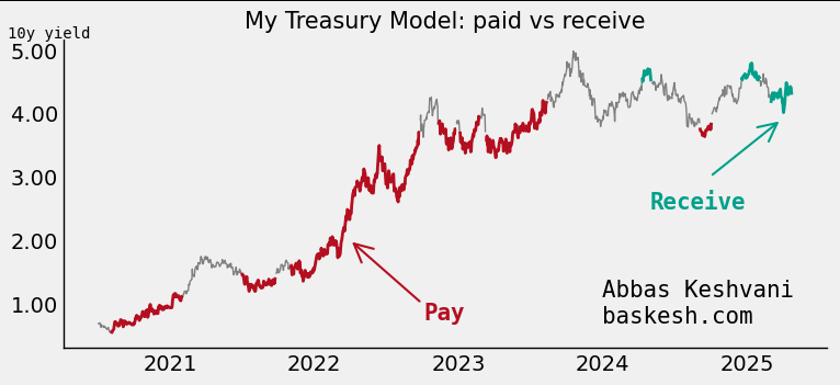
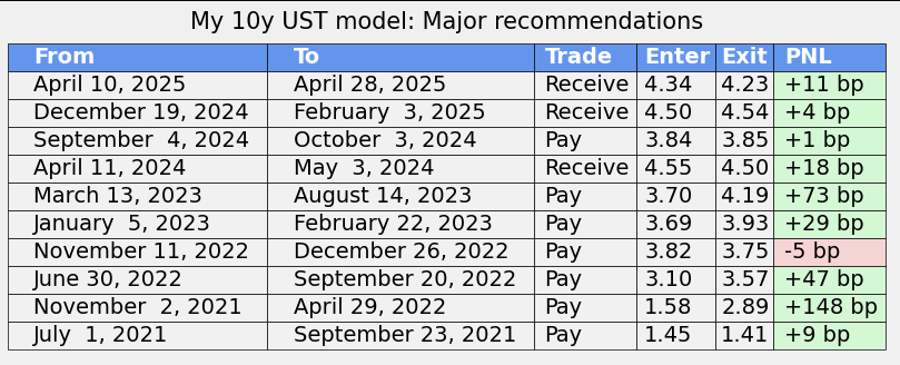
It works. A measure of the model’s success is that it has produced 10 major recommendations in the last four years, and 9 of them have worked, producing over 500 basis points in returns.

The model produced prescient paid recommendations in 2022 (high inflation) and 2023 (SVB), and received recommendations in 2025 (expectations for Fed cuts; still live).

These are just the major recommendations. Each row denotes a period when the model was generally paid or received, but within each period the model may have tactically turned neutral for a short period (i.e. model was neutral for one day during the April 2024 received trade)

How does it work? At the core of the model is a fair value estimate for the 10y yield, itself a blend of key macroeconomic and financial data. Independent variables are smoothed, regressed, and weighted. In addition to that, I apply a valuation filter that dictates the actual execution of the model.

An honest backtest. The above model was trained on 2017-2021 data. I then backtested it out-of-sample from 2021 onwards, and this has produced the >500bp in returns.

Current model recommendation: Receive 10y (yearend forecast of 3.50%). The model lives here.

Python-powered analysis of market trends

Every month has a different market flavor, from Chinese growth to easing of Federal Reserve policy. To illustrate this, I conducted natural language processing on daily market commentary. The result is a recap, for the last two years, of the various themes that the market has focused on.

Since 2023, we have seen the market fret about Chinese growth (summer 2023); over-anticipate Fed easing before paring back expectations (winter 23/24); focus on Japan as the Bank of Japan finally started hiking (spring 2024); analyze actual Fed easing (fall 2024); salivate on potential Chinese easing (winter 2024); and stress about tariffs (year-to-date).

We are now in the fourth month of tariffs being the main macro focus, and April thus far has seen a spike in the word “negotiation”.

Acknowledgements: The research I am analyzing is by BNZ, who leverage their timezone vantage point — as the first to see the trading day open — by producing a thorough recap of the previous day.

Method: I used my own Python code to load the reports, extract text from them, omit generic words like “the” and “lower”, count the most common words for every month, and use a mix of rules to determine every month’s macro meme. The code did all of this — over 500 reports to parse — in 178 seconds. You can contact me if you would like to see my code.

Seasonality: does it work?

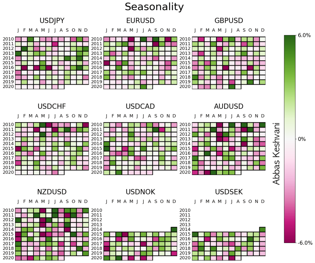
Currency traders pay a lot of attention to seasonality. “NZDUSD tends to sell-off in August” is often cited as an argument (combined with other considerations, of course) to either short the pair or at least not go long.

Yes, NZDUSD tends to sell-off in August, but does that mean you should do it?

Come September, we will probably move on to the seasonality tendencies for that month, and there is seldom a review of whether seasonality “worked” in August.

So here I’m doing just that. I am “trading” every seasonality recommendation to test whether there is any value in this metric at all. If a currency pair exhibits strong seasonality for a month – i.e. it strengthened or weakened in 4 out of 5 months in previous years – then I long/short that pair.

Its earlier stuff was better

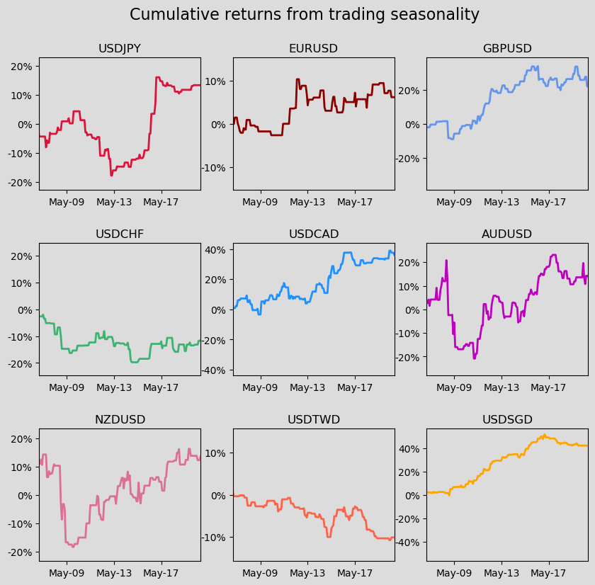
The results are decent, but they’re neither unanimous (some currencies do better than others) nor consistent over time (lately, seasonality hasn’t been doing that well).

  • Seasonality has never been a particularly successful strategy for USDCHF or USDTWD
  • For currencies where it has been successful, that success petered out around 2017
Combined returns of a seasonality strategy for G10 excluding NOK and SEK

So the short answer is that this is a strategy whose best years are probably behind it. Since 2017, you wouldn’t have lost much on seasonality, but you would not have made much either.

Everything done on Python.

Tracking the RBI

At the August meeting of the RBI, the Indian central bank kept the repo rate, its benchmark interest rate, unchanged. Around half of economists had expected a policy rate cut (India is in a pandemic after all!). But inflation in the country has exceeded the upper-bound of the RBI’s target range, and a lot of economists correctly forecasted that the central bank would not cut.

Between speeches, statements, and economic data, there is a lot to track for the RBI. So I have produced an RBI sentiment index in an attempt to objectively quantify and automate the tracking of:

  • Monetary policy statements (around 4-6 per year)
  • Speeches (over 20 last year)
  • CPI prints (12 per year)

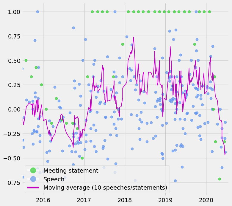
Interpretation: The index is a moving average of the last 10 statements/speeches/CPI prints and can oscillate between -1 and +1. A score of +1 means that the RBI sounds optimistic about the economy and inflation is high, so one can reasonably expect the policy rate to be increased. -1 means the RBI sounds pessimistic and that inflation is low, so we can expect rate cuts.

As you can see the index has come off quite a bit since March, mostly due to pessimistic rhetoric as Covid-19 has taken a toll on India’s economy. The index would have fallen further if not for high inflation prints recently. But that is the point: the index should reflect the constraints imposed by inflation (i.e. you can be pessimistic about the economy but unable to cut due to high inflation).

An interesting overlay is between this index and bond yields. Low bond yields indicate that the market expect the central bank to cut rates, but as you can see, the RBI might be thinking differently right now. Even if you look past high inflation, some of the recent speeches and the August meeting statement show an improvement in RBI sentiment.

Details of the index:

NLP to automate scoring of rhetoric: I have used Python to automate the process of scraping all speeches and scoring them on a scale of -1 (pessimistic about the economy) to +1 (optimistic). While I was at it, I also did the same process for all RBI statements. The methodology is explained in more detail here.

Adding inflation data to the mix: I was worried that RBI speeches and statements were not adequately discussing inflationary pressure. This is particularly problematic for a country like India, which dealt with double digit inflation as recently as 2013 and where the CPI index has swung from 2.1% in January 2019 to 6.9% in July 2020. Compare that to the US, where core PCE inflation has mostly observed a humble range of 1-2%.

Everything done on Python.

Python vs Jupyter vs Spyder vs IDLE…

There are so many “words” around Python. There is clearly an entire ecosystem here. Here I break it down un-comprehensively.

Python is the language. You run Python on one of the following:

  • Terminal / command prompt: This is the black screen with white/green text used by computer geniuses in movies. Very basic, you can’t click anything.
  • Text editor: Not as “bare” as Terminal – has basic functionality. Examples include Atom, Vim, Notepad (yes you can run Python on the thing you use to jot down reminders). Technically Jupyter is not a text editor – it’s a web application – but it behaves like a text editor.
  • Integrated Development Environment (IDE): comes with bells and whistles, which make working on Python easier. Using an IDE is like using Word instead of Notepad to write an essay. Examples include Spyder, PyCharm, IDLE.

Anaconda is a bundle which includes Python as well as Spyder (IDE) and a button which opens up Jupyter on your web browser. I use Anaconda to use Spyder to use Python, if that makes sense.

Which one is the best one to use? It depends on what you want and I have not tested them all, but I like Spyder for data science and analysis.

Tracking Fed sentiment

Members of the Federal Open Market Committee, the body which decides the Fed’s interest rate policy, have their words closely scrutinized for hints about what the next policy change could be. Aside from the official policy-setting meetings (around eight per year), FOMC members give speeches throughout the year (78 in 2019).

Here I use natural-language processing (NLP) to assign a score to each of those speeches, as well as official FOMC statements.

As expected, the index shows that recent Fed speeches have been relatively negative in their tone.

Method:

The formula I use to calculate a speech’s score is based off the number of positive words and negative words in that speech/statement.

Score = \frac{Count_{positive}-Count_{negative}}{Count_{positive}+Count_{negative}}

A score of +1 means that a speech had only positive words like “efficient”, “strong” and “resilient”, while -1 means it had only negative words like “repercussions”, “stagnate”, and “worsening”. The dictionary I use to determine whether a word is positive is based off (I have modified it) a 2017 paper published by the Federal Reserve Board1.

One also has to account for negation. A statement like “growth is not strong” has a positive word in it (“strong”) which should actually be counted as a negative word. As such, if a positive word is within three words of a negation word like “not” or “never”, then it is treated as a negative word. On the other hand, a negative word near a negation word (“growth is not poor”) is simply not counted, rather than treated as a positive word.

I downloaded the speeches and statements, did the NLP analysis, and produced the charts on Python.

Relation with yields:

Here I chart the Fed sentiment index against the US 2y yields, as well as the sentiment scores of the official meeting statements. The index moved higher from late 2016 to early 2018 as the Fed started hiking policy.

However in early 2018 the sentiment index indicated that the Fed had turned less positive, but yields continued moving higher as the hiking cycle continued. It is also important to note that sometimes a shift in FOMC thinking/language drives market price-action, and sometimes it is the other way round, so one cannot expect the index to always presage higher or lower yields.

As we go into the September FOMC meeting, where some people are expecting the Fed to announce yield curve control, keeping an objective eye on Fed sentiment will become even more important.

Everything done on Python.

Abbas Keshvani

References:

1Correa, Ricardo, Keshav Garud, Juan M. Londono, and Nathan Mislang (2017) – Sentiment in Central Banks’ Financial Stability Reports. International Finance Discussion Papers 1203.

What markets are focused on, part II

Following my recent post about the most referenced topic in FX commentary (in my case, excellent daily commentary from BNZ), I received a number of questions from readers about whether topic X was being talked about more or less.

So I visualized the data differently for all those interested – this time as time series. Each chart show the number of references made to a particular topic on a monthly basis.

NLP panel

References to the trade war, Fed and Trump increased in May. Meanwhile references to Covid-19 have been consistently sliding lower every month since March.

See last post for methodology. Everything done on Python.

Abbas Keshvani

What markets are focused on

An updated version of this chart for June 2020 was shared with subscribers of TLR Wire, the esteemed economics newsletter managed by Philippa Dunne and Doug Henwood.

The financial sector produces a lot of commentary on the things affecting markets. A lot of this year’s commentary has been focused on Covid-19, but before that there was a lot of literature being produced on the US-China trade war and Brexit.

Here I chart, for every month, the most talked about issue in financial literature. I did this by pulling out hundreds of daily FX commentary pieces from BNZ (who do a solid job on recapping the previous day’s events) and analyzing the most used words (excluding the generic ones like “the” and “markets” and “economy”).

What markets are focused on

Naturally the total number of references to Covid-19 for a given month is not just the number of times “Covid-19” is printed, but also “coronavirus” and “virus”. A similar methodology is adopted for the US-China trade war.

While Covid-19 remained in the top 5 of topics for May, we can see the focus is starting to balance out, with the the Fed getting the most number of references as we approach the June meeting (which will have the Fed’s quarterly economic projections (which they skipped in March). There was also a pick-up in references to “Trump” and “trade” this month, suggesting that we aren’t quite done with the US-China theme.

Data mining, text-analysis and chart all done on Python.

Abbas Keshvani

The Fed’s balance sheet

The Federal Reserve (or “Fed”) is the central bank of the United States, in charge of setting interest rates, regulating banks, maintaining the stability of the financial system, and providing financial services such as swap lines (which temporarily provide foreign central banks with dollars).

The Fed has its own balance sheet, which means its owns assets such as US government bonds (“Treasuries”) and has liabilities such as reserves (cash which financial institutions keep with the Fed) and currency (which technically counts as a liability because the Fed “owes” you things for the dollars you hold – historically it was gold, but now it is other assets such as bonds).

Fed BS

  • In the aftermath of the Great Recession from 2008, the Fed undertook Quantitative Easing (QE), which means it created new money to buy bonds and loans. This increased its balance sheet from roughly $1 trillion in 2008 to $4.5 trillion in 2014.
  • From 2014 to 2018, the Fed stopped buying additional bonds and loans under QE, and its balance sheet stabilized.
  • From 2018 to 2019, the Fed started to sell some of its assets, but this only reduced the balance sheet to around $3.8 trillion.
  • Around the Covid-19 outbreak, the Fed started buying assets again and also temporarily provided dollars to other central banks. This has ballooned the Fed’s balance sheet to around $6.6 trillion today.

Graph produced on Python, data from Federal Reserve.

Abbas Keshvani

Mapping Covid-19 cases: a Shiny app

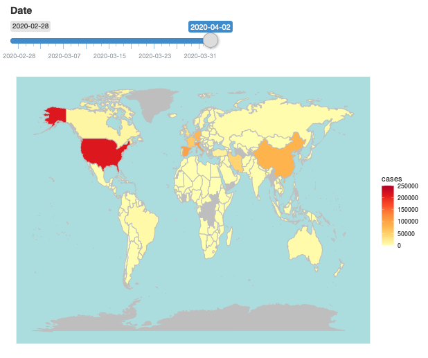
R lets you create charts and graphs in image form. But the Shiny package lets you create those same charts and graphs in interactive format. I created my first Shiny chart: a world map of confirmed Covid-19 cases. Check it out here.

Unfortunately I cannot embed the app into this website right now, so the below is merely a screenshot. Click the link to play with the app itself.

Screenshot 2020-04-05 at 12.31.34

Data from a variety of public sources, compiled by the John Hopkins Center for Systems Science and Engineering.

Abbas Keshvani

How to perform PCA on R

This is a practical tutorial on performing PCA on R. If you would like to understand how PCA works, please see my plain English explainer here.

Reminder: Principal Component Analysis (PCA) is a method used to reduce the number of variables in a dataset.

We are using R’s USArrests dataset, a dataset from 1973 showing, for each US state, the:

  1. rate per 100,000 residents of murder
  2. rate per 100,000 residents of rape
  3. rate per 100,000 residents of assault
  4. % of the population that is urban

crime

Now, we will simplify the data into two-variables data. This does not mean that we are eliminating two variables and keeping two; it means that we are replacing the four variables with two brand new ones called “principal components”.

This time we will use R’s princomp function to perform PCA.

Preamble: you will need the stats package.

Step 1: Standardize the data. You may skip this step if you would rather use princomp’s inbuilt standardization tool*.

Step 2: Run pca=princomp(USArrests, cor=TRUE) if your data needs standardizing / princomp(USArrests) if your data is already standardized.

Step 3: Now that R has computed 4 new variables (“principal components”), you can choose the two (or one, or three) principal components with the highest variances.

You can run summary(pca) to do this. The output will look like this:
summarypca

As you can see, principal components 1 and 2 have the highest standard deviation / variance, so we should use them.

Step 4: Finally, to obtain the actual principal component coordinates (“scores”) for each state, run pca$scores:
score

Step 5: To produce the biplot, a visualization of the principal components against the original variables, run biplot(pca):
biplot

The closeness of the Murder, Assault, Rape arrows indicates that these three types of crime are, intuitively, correlated. There is also some correlation between urbanization and incidence of rape; the urbanization-murder correlation is weaker.

*princomp will turn your data into z-scores (i.e. subtract the mean, then divide by the standard deviation). But in doing so, one is not just standardizing the data, but also rescaling it. I do not see the need to rescale, so I choose to manually translate the data onto a standard range of [0,1] using the equation:

\frac{x_{i}-x_{min}}{x_{max}-x_{min}}

Abbas Keshvani

Expect less oil supply

In my last post, I talked about how shale supply has depressed oil prices by increasing its supply. Recall this graph which shows that the increased supply is primarily from America (the top pink line):

The glut is mostly due to America producing more oil
America producing more oil

Since lower prices are mainly enabled by American shale supply, a decrease in shale supply will have a major impact on prices. And it does look like shale supply might wind down. The next graph shows how American oil production responds (eventually) to the number of oil rigs in America.

Just to clarify, “rigs” here refers to rotary rigs – the machines that drill for new oil wells. The actual extraction is done by wells, not rigs. But US oil supply shows a remarkable (lagged) covariance with rig count. From the 1990 to 2000, the number of rigs decreased, and oil supply followed it down. Then, when the number of rigs jumped in 2007, oil supply also rose with it.

Note that the number of American rigs has plummeted since the start of 2015. It is no coincidence that oil prices hit a record low in January 2015. At these paltry prices, oil companies have less of an impetus to dig for more oil.

The number of oil rings in America has halved since January 2015

The break-even price for shale oil varies according to the basin (reservoir) it comes from. A barrel from Bakken-Parshall-Sanish (proven reserves: 1 billion barrels) costs $60, while a barrel from Utica-Condensate (4.5 billion barrels) costs $95. The reserve-weighted average price is $76.50. These figures were calculated by Wood McKenzie, an oil consulting firm, and can be viewed in detail here.

As the number of rigs has halved to 800, the United States will not be able to keep up its record supply. Keep in mind that wells are running dry all the time, so less rigging will eventually mean less oil. Perhaps shale supply will decrease, with consequences for oil prices. To put things in perspective, the last time America had only 800 rigs (end January 2011), oil was at $97 a barrel.

Oil probably will not return to $100 a barrel. If it does, shale oil will become profitable again (the threshold is $76), American shale rigs will come online again, supply will increase and prices will come down again. So oil will have to find a new equilibrium price to be stable. A reasonable level to expect for this equilibrium is around $70, the break-even price for shale.

There will probably be a lag in the reduction of American supply: Note how oil supply does not immediately respond to the number of rigs. But things move faster when expectations are at play. On the 6th of April, traders realized Iranian rigs were not going to come online as fast as they thought. Oil prices rose 5% in one night. American supply does not have to come down for prices to drop: traders simply have to realize prices will come down.

Data from US Energy Information Agency and Baker Hughes, an oil rig services provider. Graphs plotted on R.

Abbas Keshvani

Principal Component Analysis in 6 steps

Read this to understand how PCA works. To skip to the steps, Ctrl+F “step 1”. To perform PCA on R, click here.

What is PCA?

Principal Component Analysis, or PCA, is a statistical method used to reduce the number of variables in a dataset. It does so by lumping highly correlated variables together. Naturally, this comes at the expense of accuracy. However, if you have 50 variables and realize that 40 of them are highly correlated, you will gladly trade a little accuracy for simplicity.

How does PCA work?

Say you have a dataset of two variables, and want to simplify it. You will probably not see a pressing need to reduce such an already succinct dataset, but let us use this example for the sake of simplicity.

The two variables are:

  1. Dow Jones Industrial Average, or DJIA, a stock market index that constitutes 30 of America’s biggest companies, such as Hewlett Packard and Boeing.
  2. S&P 500 index, a similar aggregate of 500 stocks of large American-listed companies. It contains many of the companies that the DJIA comprises.

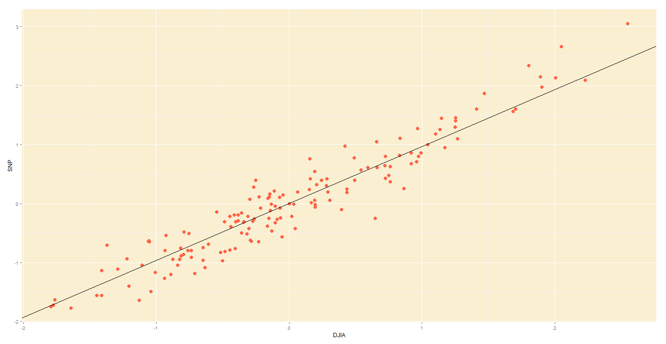
Not surprisingly, the DJIA and FTSE are highly correlated. Just look at how their daily readings move together. To be precise, the below is a plot of their daily % changes.

DJIA vs S&P
DJIA vs S&P

The above points are represented in 2 axes: X and Y. In theory, PCA will allow us to represent the data along one axis. This axis will be called the principal component, and is represented by the black line.

DJIA vs S&P with principle component line
DJIA vs S&P with principal component line

Note 1: In reality, you will not use PCA to transform two-dimensional data into one-dimension. Rather, you will simplify data of higher dimensions into lower dimensions.

Note 2: Reducing the data to a single dimension/axis will reduce accuracy somewhat. This is because the data is not neatly hugging the axis. Rather, it varies about the axis. But this is the trade-off we are making with PCA, and perhaps we were never concerned about needle-point accuracy. The above linear model would do a fine job of predicting the movement of a stock and making you a decent profit, so you wouldn’t complain too much.

How do I do a PCA?

In this illustrative example, I will use PCA to transform 2D data into 2D data in five steps.

Step 1 – Standardize:

Standardize the scale of the data. I have already done this, by transforming the data into daily % change. Now, both DJIA and S&P data occur on a 0-100 scale.

Step 2 – Calculate covariance:

Find the covariance matrix for the data. As a reminder, the covariance between DJIA and S&P – Cov(DJIA, S&P) or equivalently, Cov(DJIA, S&P) – is a measure of how the two variables move together.

By the way, cor(X,Y) = \frac{cov(X,Y)}{\sigma _{X}\cdot \sigma_{Y}}

The covariance matrix for my data will look like:

\begin{bmatrix}  Cov(DJIA,DJIA) & Cov(DJIA,S\&P)\\  Cov(S\&P,DJIA) & Cov(S\&P,S\&P)  \end{bmatrix}  =  \begin{bmatrix}  Var(DJIA) & Cov(DJIA,S\&P)\\  Cov(S\&P,DJIA) & Var()S\&P)  \end{bmatrix}  \vspace{1cm}  \newline  = \begin{bmatrix}  0.7846 & 0.8012\\  0.8012 & 0.8970  \end{bmatrix}

Step 3 – Deduce eigens:

Do you remember we graphically identified the principal component for our data?

DJIA vs S&P with principle component line
DJIA vs S&P with principal component line

The main principal component, depicted by the black line, will become our new X-axis. Naturally, a line perpendicular to the black line will be our new Y axis, the other principal component. The below lines are perpendicular; don’t let the aspect ratio fool you.

new axes
If we used the black lines as our x and y axes, our data would look simpler

Thus, we are going to rotate our data to fit these new axes. But what will the coordinates of the rotated data be?

To convert the data into the new axes, we will multiply the original DJIA, S&P data by eigenvectors, which indicate the direction of the new axes (principal components).

But first, we need to deduce the eigenvectors (there are two – one per axis). Each eigenvector will correspond to an eigenvalue, whose magnitude indicates how much of the data’s variability is explained by its eigenvector.

As per the definition of eigenvalue and eigenvector:

\begin{bmatrix}  Covariance &matrix  \end{bmatrix}  \cdot  \begin{bmatrix}  Eigenvector  \end{bmatrix}  =  \begin{bmatrix}  eigenvalue  \end{bmatrix}  \cdot  \begin{bmatrix}  Eigenvector  \end{bmatrix}

We know the covariance matrix from step 2. Solving the above equation by some clever math will yield the below eigenvalues (e) and eigenvectors (E):

e_{1}=1.644

E_{1}= \begin{bmatrix} 0.6819 \\ -0.7314 \end{bmatrix}

e_{2}=0.0376

E_{1}= \begin{bmatrix} -0.7314 \\ 0.6819 \end{bmatrix}

Step 4 – Re-orient data:

Since the eigenvectors indicates the direction of the principal components (new axes), we will multiply the original data by the eigenvectors to re-orient our data onto the new axes. This re-oriented data is called a score.

Sc = \begin{bmatrix}  Orig. \: data  \end{bmatrix}  \cdot  \begin{bmatrix}  Eigvectors  \end{bmatrix}  =  \begin{bmatrix}  DJIA_{1} & S\&P_{1}\\  DJIA_{2} & S\&P_{2}\\  ... & ...\\  DJIA_{150} & S\&P_{150}  \end{bmatrix}  \cdot  \begin{bmatrix}  0.6819 & 0.7314\\  -0.7314 & 0.6819  \end{bmatrix}

Step 5 – Plot re-oriented data:

We can now plot the rotated data, or scores.

Original data, re-oriented to fit new axes

Step 6 – Bi-plot:

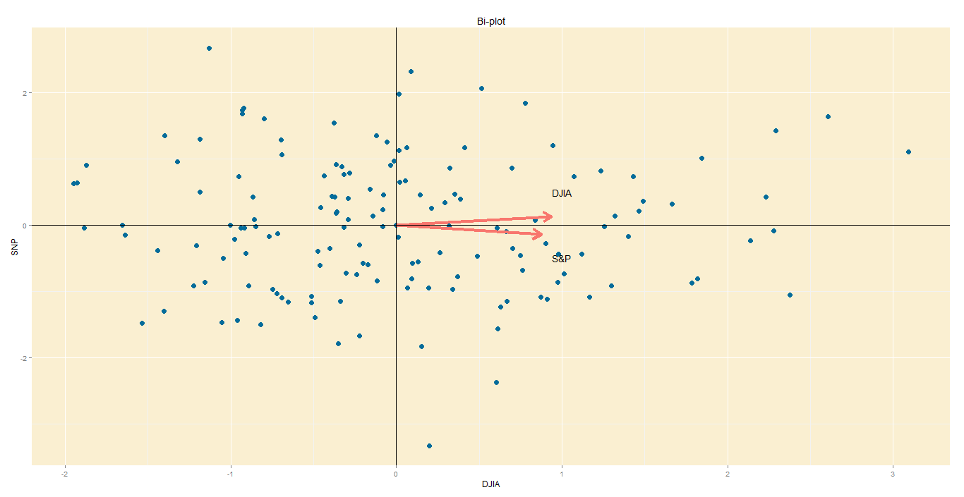
A PCA would not be complete without a bi-plot. This is basically the plot above, except the axes are standardized on the same scale, and arrows are added to depict the original variables, lest we forget.

  • Axes: In this bi-plot, the X and Y axes are the principal components.
  • Points: These are the DJIA and S&P points, re-oriented to the new axes.
  • Arrows: The arrows point in the direction of increasing values for each original variable. For example, points in the top right quadrant will have higher DJIA readings than points in the bottom left quadrant. The closeness of the arrows means that the two variables are highly correlated.

Bi-plot
Bi-plot

Data from St Louis Federal Reserve; PCA performed on R, with help of ggplot2 package for graphs.

Abbas Keshvani

World Wide Wage

South Koreans earn, on average, $33,140 per year (PPP), making them almost as rich as Britons. However, Koreans also work 30% more hours than Britons, making their per-hour wage considerably less than a British wage. In fact, the Korean wage of $15 per hour (PPP) is comparable to that of a Czech or Slovakian.

Here is a map of the working hours of mostly OECD countries.

Hours worked per week

As you can see, people in developing countries have to work longer hours. The exception is South Korea, which works pretty hard for a rich country – harder than Brazil and Poland do. If you divide per-capita income by working hours, you get a person’s hourly wage:

World Wide Wage
World Wide Wage

The top 10 earners by wage are mostly northern Europeans – Norway, Germany, Denmark, Sweden, Switzerland, Netherlands – and small financial centres Singapore and Luxembourg. As the first to industrialize, Europeans found they were able to mechanize ploughing, assembling and number-crunching – boosting incomes, while simultaneously decreasing working hours.

The bottom earners are developing countries – such as Mexico, Brazil and Poland. Again, Korea stands out as a rich country with low wages. This could be because Korea exported their way into prosperity by winning over Western consumers from the likes of General Motors and General Electric. They did this by combining industrialization with low wages, which are therefore responsible for the ascent of their economies.

Data from World Bank, OECD, and BBC. Maps created on R.

 Abbas Keshvani

If Scotland becomes a country

On the 18th of September 2014, Scottish people will vote on secession from the United Kingdom, potentially ending a union that has existed since 1707. If Scots vote “Yes” to end the union, the United Kingdom will consist of England, Wales and Northern Ireland, while the newly created country of Scotland may look like this:

scotland

Basically, Scotland would look a lot like Finland. The two countries have similar populations, GDP, and even their respective largest cities are about the same size.

Abbas Keshvani

I am probably watching TV right now

I got an email from a gentlemen boasting labor data that even the Bureau of Labor Statistics hasn’t published yet!

Retale, a tool that helps you scour advertisements for deals in your area, has produced a cool infograph on what Americans are doing right now. It tells you what activities Americans are doing at different times of the day: at 9PM, 34% of Americans are watching TV, 7% are still working, etc…

average american

The data is pretty reliable, as it is from the Bureau of Labor Statistics. You can even break down the graphs into various demographics: men, women, 45-54 year olds, retirees….

Even though I am not American, the model predicts correctly that I am watching TV right now. The TV is on in the background as I type this, so close enough.

Check out the infograph here.

Abbas Keshvani

Indian Elections 2014 – a Summary

India conducted general elections between 7th April and 12th May , which elected a Member of Parliament to represent each of the 543 constituencies that make up the country.

The opposition BJP won 31% of the votes, which yielded them 282 out of 543 seats in parliament, or 52% of all seats. The BJP allied with smaller parties, such as the Telugu Desam Party, to form the National Democratic Alliance (NDA). Altogether, the NDA won 39% of the votes and 336 seats (62%).

india
India’s parties, topped up by their allies

Turnout was pretty good: 541 million Indians, or 66% of the total vote bank, participated in the polls.

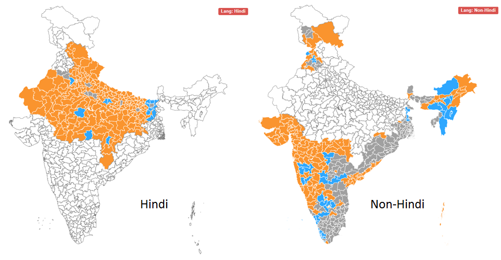
Google and Bing both performed excellent analytics on the election results, but I thought Bing’s was easier to use since their visual is a clean and simple India-only map. They actually out-simpled Google this time.

You are more likely to vote BJP if you speak Hindi
Bing: A constituency is more likely to elect BJP (orange) if its people speak Hindi

Interestingly, the BJP’s victories seem to come largely from Hindi speakers, traditionally concentrated in the north and west parts of India. Plenty of non-Hindi speakers voted for the BJP too, such as in Gujarat and Maharashtra, but votes in south and east of the country generally went to a more diverse pantheon of parties.

Abbas Keshvani

How to do a chi-square test in 7 steps

What is a chi-square test: A chi square tests the relationship between two attributes. Suppose we suspect that rural Americans tended to vote Romney, and urban Americans tended to vote Obama. In this case, we suspect a relationship between where you live and whom you vote for.

The full name for this test is Pearson’s Chi-Square Test for Independence, named after Carl Pearson, the founder of modern Statistics.

How to do it:

We will use a fictitious poll conducted of 100 people. Each person was asked where they live and whom they voted for.

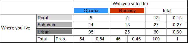
  1. Draw a chi-square table.
    .
    Each row will be whom you voted for, giving us two columns for Obama and Romney. Each row will be where you live, giving us three rows – rural, suburban and urban.
  2. Calculate totals for each row and column.
    .
    The purpose of the first column total is to find out how many votes Obama got from all areas. Similarly, the purpose of the first row total is to find out how rural votes were cast for either candidate.
  3. Calculate probabilities for each row and column.
    .
    These will be the individual probabilities of voting Obama, voting Romney, living in the country, etc… For example, the Obama column total tells us that 54 out of 100 people polled voted Obama, so probability of voting Obama is 0.54.
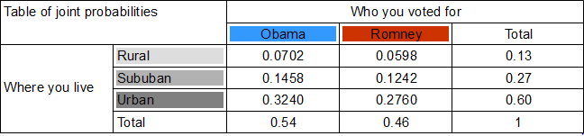
  4. Calculate the joint probabilities of belonging to each category.
    .
    For example, probability of being rural and an Obama voter is found by multiplying the probability of voting Obama (0.54) with the probability of living in the country (0.13). So, 0.54 x 0.13 = A person has a 0.0702 chance of being a rural Obama voter.
    .
    In doing so, we assume that where you live and whom you voted for are independent. This assumption, called the null hypothesis, may well be wrong , and we will test it later by testing the joint probabilities it yielded.
  5. Based on these joint probabilities, how many people do we expect to belong to each category?
    .
    We multiply the joint probability for each category by 100, the number of people.
  6. These expected numbers are based on the assumption (hypothesis) that whom you voted for and where you live are independent. We can test this hypothesis by holding these expected numbers against the actual numbers we have.
    .
    First, we need our chi-square value \chi^{2}.
    .
    \chi^{2}=\sum_{i=1}^{K}\frac{(O_{i}-E_{i})^{2}}{E_{i}}
    .
    Basically, the equation asks that, for each category, you find the discrepancy between the observed number O_{i} and expected number E_{i}, square it, and then divide it by the expected number E_{i}. Finally, add up the figures for each category.

    .
    I got 0.769 as my chi-square value.
    .
  7. Look at a chi-square table.
    .
    Note that out degrees of freedom in a chi square test is \left ( N_{row}-1 \right )\times \left ( N_{col}-1 \right ). In our case, with 3 rows and 2 columns, we get 2 degrees of freedom.
    .
    For a 0.05 level of significance and 2 degrees of freedom, we get a threshold (minimum) chi-square value of 5.991. Since our chi-square value 0.769 is smaller than the minimum, we cannot reject the null hypothesis that where you live and who you voted for are independent.

That is the end of the chi square test for independence.

Abbas Keshvani