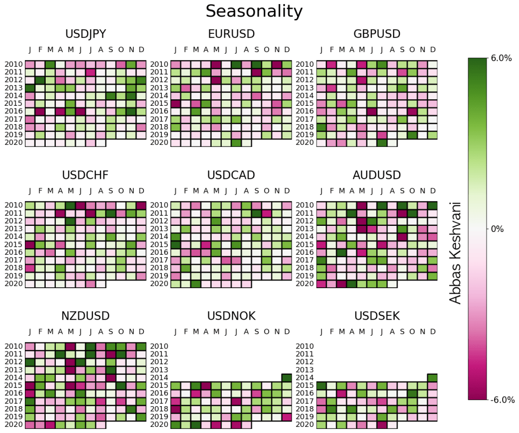
Currency traders pay a lot of attention to seasonality. “NZDUSD tends to sell-off in August” is often cited as an argument (combined with other considerations, of course) to either short the pair or at least not go long.
Yes, NZDUSD tends to sell-off in August, but does that mean you should do it?
Come September, we will probably move on to the seasonality tendencies for that month, and there is seldom a review of whether seasonality “worked” in August.
So here I’m doing just that. I am “trading” every seasonality recommendation to test whether there is any value in this metric at all. If a currency pair exhibits strong seasonality for a month – i.e. it strengthened or weakened in 4 out of 5 months in previous years – then I long/short that pair.
Its earlier stuff was better
The results are decent, but they’re neither unanimous (some currencies do better than others) nor consistent over time (lately, seasonality hasn’t been doing that well).
Seasonality has never been a particularly successful strategy for USDCHF or USDTWD
For currencies where it has been successful, that success petered out around 2017
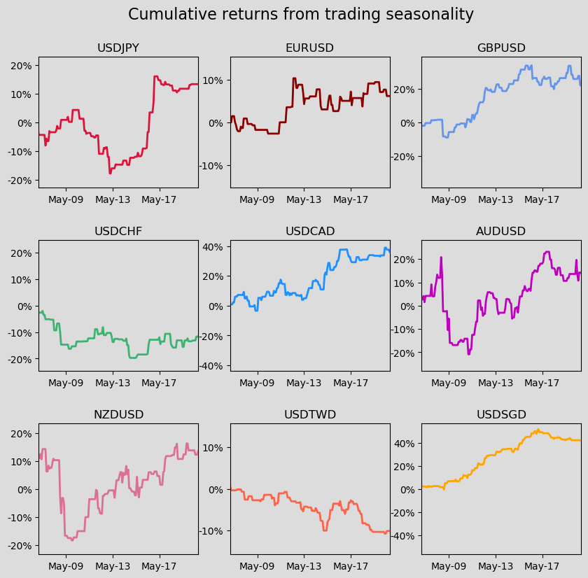
Combined returns of a seasonality strategy for G10 excluding NOK and SEK
So the short answer is that this is a strategy whose best years are probably behind it. Since 2017, you wouldn’t have lost much on seasonality, but you would not have made much either.
This is a practical tutorial on performing PCA on R. If you would like to understand how PCA works, please see my plain English explainer here.
Reminder: Principal Component Analysis (PCA) is a method used to reduce the number of variables in a dataset.
We are using R’s USArrests dataset, a dataset from 1973 showing, for each US state, the:
rate per 100,000 residents of murder
rate per 100,000 residents of rape
rate per 100,000 residents of assault
% of the population that is urban
Now, we will simplify the data into two-variables data. This does not mean that we are eliminating two variables and keeping two; it means that we are replacing the four variables with two brand new ones called “principal components”.
This time we will use R’s princomp function to perform PCA.
Preamble: you will need the stats package.
Step 1: Standardize the data. You may skip this step if you would rather use princomp’s inbuilt standardization tool*.
Step 2: Run pca=princomp(USArrests, cor=TRUE) if your data needs standardizing / princomp(USArrests) if your data is already standardized.
Step 3: Now that R has computed 4 new variables (“principal components”), you can choose the two (or one, or three) principal components with the highest variances.
You can run summary(pca) to do this. The output will look like this:
As you can see, principal components 1 and 2 have the highest standard deviation / variance, so we should use them.
Step 4: Finally, to obtain the actual principal component coordinates (“scores”) for each state, run pca$scores:
Step 5: To produce the biplot, a visualization of the principal components against the original variables, run biplot(pca):
The closeness of the Murder, Assault, Rape arrows indicates that these three types of crime are, intuitively, correlated. There is also some correlation between urbanization and incidence of rape; the urbanization-murder correlation is weaker.
*princomp will turn your data into z-scores (i.e. subtract the mean, then divide by the standard deviation). But in doing so, one is not just standardizing the data, but also rescaling it. I do not see the need to rescale, so I choose to manually translate the data onto a standard range of [0,1] using the equation:
Read this to understand how PCA works. To skip to the steps, Ctrl+F “step 1”. To perform PCA on R, click here.
What is PCA?
Principal Component Analysis, or PCA, is a statistical method used to reduce the number of variables in a dataset. It does so by lumping highly correlated variables together. Naturally, this comes at the expense of accuracy. However, if you have 50 variables and realize that 40 of them are highly correlated, you will gladly trade a little accuracy for simplicity.
How does PCA work?
Say you have a dataset of two variables, and want to simplify it. You will probably not see a pressing need to reduce such an already succinct dataset, but let us use this example for the sake of simplicity.
The two variables are:
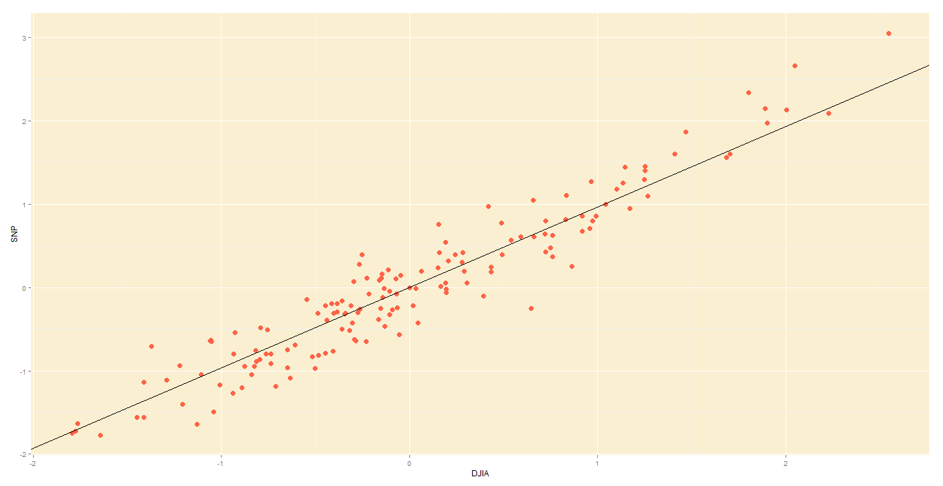
Dow Jones Industrial Average, or DJIA, a stock market index that constitutes 30 of America’s biggest companies, such as Hewlett Packard and Boeing.
S&P 500 index, a similar aggregate of 500 stocks of large American-listed companies. It contains many of the companies that the DJIA comprises.
Not surprisingly, the DJIA and FTSE are highly correlated. Just look at how their daily readings move together. To be precise, the below is a plot of their daily % changes.
DJIA vs S&P
The above points are represented in 2 axes: X and Y. In theory, PCA will allow us to represent the data along one axis. This axis will be called the principal component, and is represented by the black line.
DJIA vs S&P with principal component line
Note 1: In reality, you will not use PCA to transform two-dimensional data into one-dimension. Rather, you will simplify data of higher dimensions into lower dimensions.
Note 2: Reducing the data to a single dimension/axis will reduce accuracy somewhat. This is because the data is not neatly hugging the axis. Rather, it varies about the axis. But this is the trade-off we are making with PCA, and perhaps we were never concerned about needle-point accuracy. The above linear model would do a fine job of predicting the movement of a stock and making you a decent profit, so you wouldn’t complain too much.
How do I do a PCA?
In this illustrative example, I will use PCA to transform 2D data into 2D data in five steps.
Step 1 – Standardize:
Standardize the scale of the data. I have already done this, by transforming the data into daily % change. Now, both DJIA and S&P data occur on a 0-100 scale.
Step 2 – Calculate covariance:
Find the covariance matrix for the data. As a reminder, the covariance between DJIA and S&P – Cov(DJIA, S&P) or equivalently, Cov(DJIA, S&P) – is a measure of how the two variables move together.
By the way,
The covariance matrix for my data will look like:
Step 3 – Deduce eigens:
Do you remember we graphically identified the principal component for our data?
DJIA vs S&P with principal component line
The main principal component, depicted by the black line, will become our new X-axis. Naturally, a line perpendicular to the black line will be our new Y axis, the other principal component. The below lines are perpendicular; don’t let the aspect ratio fool you.
If we used the black lines as our x and y axes, our data would look simpler
Thus, we are going to rotate our data to fit these new axes. But what will the coordinates of the rotated data be?
To convert the data into the new axes, we will multiply the original DJIA, S&P data by eigenvectors, which indicate the direction of the new axes (principal components).
But first, we need to deduce the eigenvectors (there are two – one per axis). Each eigenvector will correspond to an eigenvalue, whose magnitude indicates how much of the data’s variability is explained by its eigenvector.
As per the definition of eigenvalue and eigenvector:
We know the covariance matrix from step 2. Solving the above equation by some clever math will yield the below eigenvalues (e) and eigenvectors (E):
Step 4 – Re-orient data:
Since the eigenvectors indicates the direction of the principal components (new axes), we will multiply the original data by the eigenvectors to re-orient our data onto the new axes. This re-oriented data is called a score.
Step 5 – Plot re-oriented data:
We can now plot the rotated data, or scores.
Original data, re-oriented to fit new axes
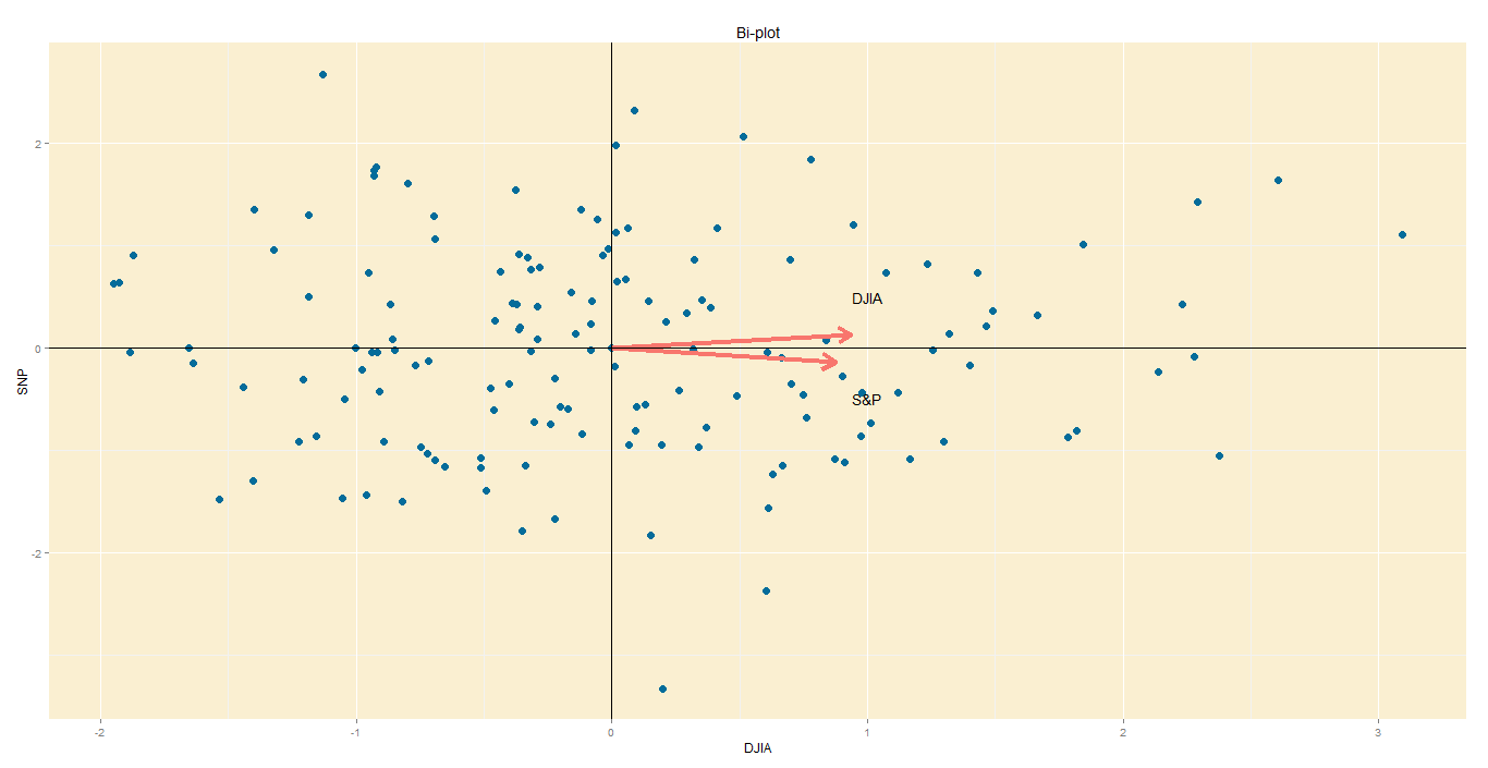
Step 6 – Bi-plot:
A PCA would not be complete without a bi-plot. This is basically the plot above, except the axes are standardized on the same scale, and arrows are added to depict the original variables, lest we forget.
Axes: In this bi-plot, the X and Y axes are the principal components.
Points: These are the DJIA and S&P points, re-oriented to the new axes.
Arrows: The arrows point in the direction of increasing values for each original variable. For example, points in the top right quadrant will have higher DJIA readings than points in the bottom left quadrant. The closeness of the arrows means that the two variables are highly correlated.
Bi-plot
Data from St Louis Federal Reserve; PCA performed on R, with help of ggplot2 package for graphs.
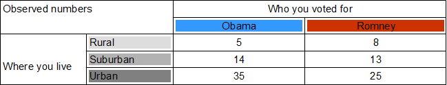
What is a chi-square test: A chi square tests the relationship between two attributes. Suppose we suspect that rural Americans tended to vote Romney, and urban Americans tended to vote Obama. In this case, we suspect a relationship between where you live and whom you vote for.
The full name for this test is Pearson’s Chi-Square Test for Independence, named after Carl Pearson, the founder of modern Statistics.
How to do it:
We will use a fictitious poll conducted of 100 people. Each person was asked where they live and whom they voted for.
Draw a chi-square table. .
Each row will be whom you voted for, giving us two columns for Obama and Romney. Each row will be where you live, giving us three rows – rural, suburban and urban.
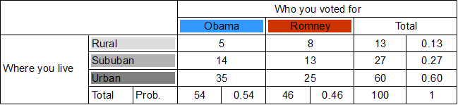
Calculate totals for each row and column. .
The purpose of the first column total is to find out how many votes Obama got from all areas. Similarly, the purpose of the first row total is to find out how rural votes were cast for either candidate.
Calculate probabilities for each row and column. .
These will be the individual probabilities of voting Obama, voting Romney, living in the country, etc… For example, the Obama column total tells us that 54 out of 100 people polled voted Obama, so probability of voting Obama is 0.54.
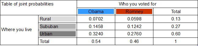
Calculate the joint probabilities of belonging to each category. . For example, probability of being rural and an Obama voter is found by multiplying the probability of voting Obama (0.54) with the probability of living in the country (0.13). So, 0.54 x 0.13 = A person has a 0.0702 chance of being a rural Obama voter. . In doing so, we assume that where you live and whom you voted for are independent. This assumption, called the null hypothesis, may well be wrong , and we will test it later by testing the joint probabilities it yielded.
Based on these joint probabilities, how many people do we expect to belong to each category? .
We multiply the joint probability for each category by 100, the number of people.
These expected numbers are based on the assumption (hypothesis) that whom you voted for and where you live are independent. We can test this hypothesis by holding these expected numbers against the actual numbers we have. . First, we need our chi-square value . . .
Basically, the equation asks that, for each category, you find the discrepancy between the observed number and expected number , square it, and then divide it by the expected number . Finally, add up the figures for each category. .
I got 0.769 as my chi-square value. .
Look at a chi-square table. .
Note that out degrees of freedom in a chi square test is . In our case, with 3 rows and 2 columns, we get 2 degrees of freedom. .
For a 0.05 level of significance and 2 degrees of freedom, we get a threshold (minimum) chi-square value of 5.991. Since our chi-square value 0.769 is smaller than the minimum, we cannot reject the null hypothesis that where you live and who you voted for are independent.
That is the end of the chi square test for independence.
Recently, Greg Laughlin, the founder of a new statistical software called Statwing, let me try his product for free. I happen to like free things very much (the college student is strong within me) so I gave it a try.
I mostly like how easy it is to use: For instance, to relate two attributes like Age and Income, you click Age, click Income, and click Relate.
So what can Statwing do?
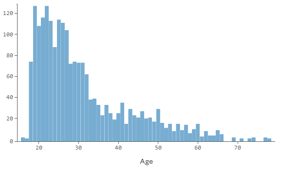
Summarize an attribute (like “age”): totals, averages, standard deviation, confidence intervals, percentiles, visual graphs like the one below
Relate two columns together (“Openness” vs “Extraversion”)
Plots the two attributes against eachother to see how they relate. It will include the formula of the regression line and the R-squared value.
Sometimes a chi-square-style table is more appropriate. The software determines how best to represent the data.
Tests the null hypothesis that the attributes are independent, by a T-test, F-test (ANOVA) or chi-square test. Statwing determines which one is appropriate.
Repeat the above for a ranked correlation.
For now, you can’t forecast a time series or represent data on maps. But Greg told me that the team is adding new features as I type this.
If you’d like to try the software yourself, click here. They’ve got three sample datasets to play with:
Titanic passengers information
The results of a psychological survey
A list of congressman, their voting record and donations.


 .
.
 and expected number
  , square it, and then divide it by the expected number
 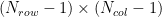 . In our case, with 3 rows and 2 columns, we get 2 degrees of freedom.