
Read this to understand how PCA works. To skip to the steps, Ctrl+F “step 1”. To perform PCA on R, click here.
What is PCA?
Principal Component Analysis, or PCA, is a statistical method used to reduce the number of variables in a dataset. It does so by lumping highly correlated variables together. Naturally, this comes at the expense of accuracy. However, if you have 50 variables and realize that 40 of them are highly correlated, you will gladly trade a little accuracy for simplicity.
How does PCA work?
Say you have a dataset of two variables, and want to simplify it. You will probably not see a pressing need to reduce such an already succinct dataset, but let us use this example for the sake of simplicity.
The two variables are:
- Dow Jones Industrial Average, or DJIA, a stock market index that constitutes 30 of America’s biggest companies, such as Hewlett Packard and Boeing.
- S&P 500 index, a similar aggregate of 500 stocks of large American-listed companies. It contains many of the companies that the DJIA comprises.
Not surprisingly, the DJIA and FTSE are highly correlated. Just look at how their daily readings move together. To be precise, the below is a plot of their daily % changes.

The above points are represented in 2 axes: X and Y. In theory, PCA will allow us to represent the data along one axis. This axis will be called the principal component, and is represented by the black line.
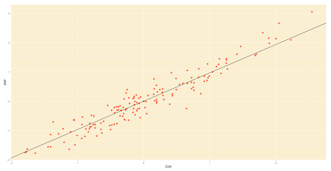
Note 1: In reality, you will not use PCA to transform two-dimensional data into one-dimension. Rather, you will simplify data of higher dimensions into lower dimensions.
Note 2: Reducing the data to a single dimension/axis will reduce accuracy somewhat. This is because the data is not neatly hugging the axis. Rather, it varies about the axis. But this is the trade-off we are making with PCA, and perhaps we were never concerned about needle-point accuracy. The above linear model would do a fine job of predicting the movement of a stock and making you a decent profit, so you wouldn’t complain too much.
How do I do a PCA?
In this illustrative example, I will use PCA to transform 2D data into 2D data in five steps.
Step 1 – Standardize:
Standardize the scale of the data. I have already done this, by transforming the data into daily % change. Now, both DJIA and S&P data occur on a 0-100 scale.
Step 2 – Calculate covariance:
Find the covariance matrix for the data. As a reminder, the covariance between DJIA and S&P – Cov(DJIA, S&P) or equivalently, Cov(DJIA, S&P) – is a measure of how the two variables move together.
By the way,

The covariance matrix for my data will look like:

Step 3 – Deduce eigens:
Do you remember we graphically identified the principal component for our data?
The main principal component, depicted by the black line, will become our new X-axis. Naturally, a line perpendicular to the black line will be our new Y axis, the other principal component. The below lines are perpendicular; don’t let the aspect ratio fool you.

Thus, we are going to rotate our data to fit these new axes. But what will the coordinates of the rotated data be?
To convert the data into the new axes, we will multiply the original DJIA, S&P data by eigenvectors, which indicate the direction of the new axes (principal components).
But first, we need to deduce the eigenvectors (there are two – one per axis). Each eigenvector will correspond to an eigenvalue, whose magnitude indicates how much of the data’s variability is explained by its eigenvector.
As per the definition of eigenvalue and eigenvector:

We know the covariance matrix from step 2. Solving the above equation by some clever math will yield the below eigenvalues (e) and eigenvectors (E):


Step 4 – Re-orient data:
Since the eigenvectors indicates the direction of the principal components (new axes), we will multiply the original data by the eigenvectors to re-orient our data onto the new axes. This re-oriented data is called a score.

Step 5 – Plot re-oriented data:
We can now plot the rotated data, or scores.

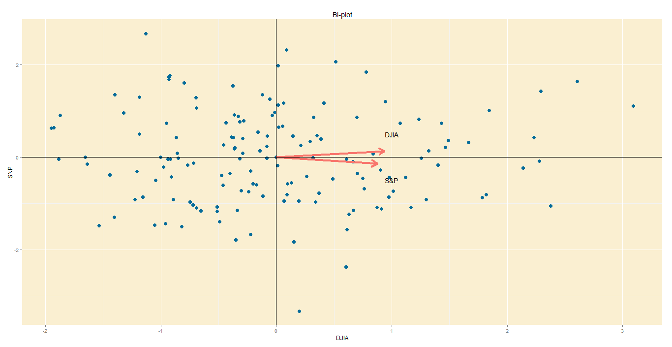
Step 6 – Bi-plot:
A PCA would not be complete without a bi-plot. This is basically the plot above, except the axes are standardized on the same scale, and arrows are added to depict the original variables, lest we forget.
- Axes: In this bi-plot, the X and Y axes are the principal components.
- Points: These are the DJIA and S&P points, re-oriented to the new axes.
- Arrows: The arrows point in the direction of increasing values for each original variable. For example, points in the top right quadrant will have higher DJIA readings than points in the bottom left quadrant. The closeness of the arrows means that the two variables are highly correlated.
Data from St Louis Federal Reserve; PCA performed on R, with help of ggplot2 package for graphs.

Thank you very much for this intuitive explanation of PCA — I found it very helpful.
As a small point, I think it should be “principal” rather than “principle” throughout the article.
Glad you found the post useful, Josh.
Good spot there! The P in PCA should indeed be Principal (adj.), rather than Principle (noun). Made the corrections.
Thanks for the information.
Would you please elaborate more about the interpretation of data. What does -ve and +ve component values of variables signifies?
Do you mean the -ve and +ve values of the score? They signify nothing, really. It is simply data that has been re-oriented on a different x and y axis.
Hello, this article really helps me understand PCA a lot.
However, some of the content confuse me and I don’t know if they are typos.
The last line of step 3, it should be E2?
The eigenvectors in step 4 should be
0.6819 -0.7314
-0.7314 0.6819
?
Thanks!
This is an amazing article on PCA! loved it. Please continue writing such articles 😉
Very helpful to someone who has a limited stats background and just wants to understand professional research papers!
If we have assets in our portfolio with different currencies should we try to make every asset prices or returns into same currency or it doesn’t matter?
How do I do a PCA?
In this illustrative example, I will use PCA to transform 2D data into 2D data in five steps.
transform 2D data into 2D data in five steps.?????
Very useful explanation in six steps.
I want to know one thing that how to get the arrows for variables from eigen values or original values? What are its calculation steps. I am using STATISTICA 7.0 software.
Awesome things here. I am very satisfied to look your article.
Thanks so much and I am looking forward to contact you.
Will you kindly drop me a mail?
This is awesome, thank you!!!
It’s nearly impossible to find knowledgeable people in this
particular topic, however, you seem like you know what you’re talking about!
Thanks