Trump’s tariffs have captivated the current news cycle and bear major ramifications for the cost of goods, global supply chains, and America’s influence in the world. The goal of his policy is to narrow America’s trade deficit, which he calls a “national emergency”.
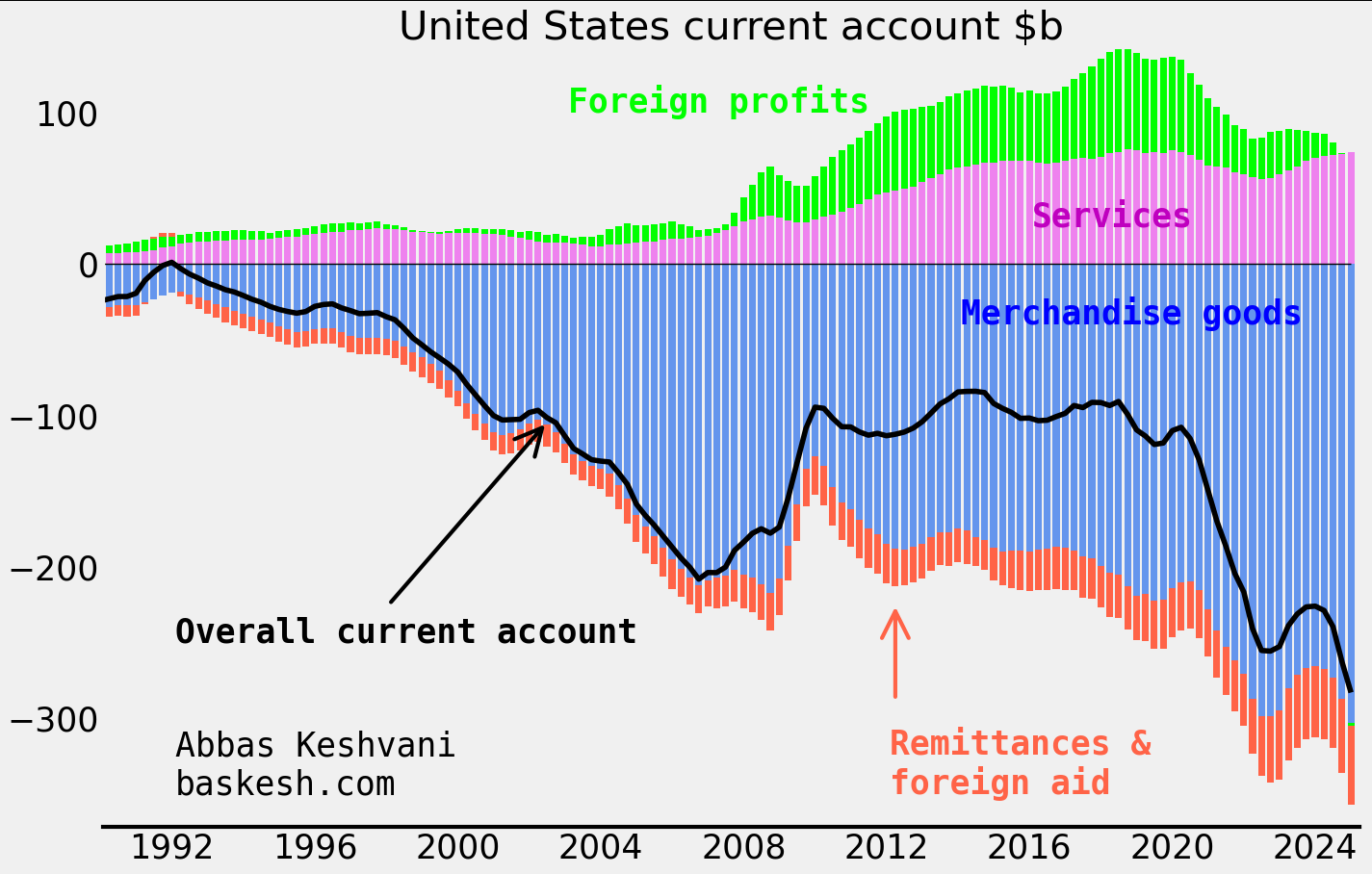
A gaping goods deficit. America experienced its first modern goods deficit in 1971, a product of the postwar industrial revival in Europe and Japan. Since then, US demand for foreign merchandise like cars and electronics have ballooned the deficit to $1.2 trillion or 3.7% of GDP in 2024. The goods deficit (blue in the below chart) dwarfs America’s surplus from services, like management consulting and software licenses. Aside from goods, other sources of outflows like foreign aid are also being targeted by Trump scaling back on America’s defense commitments.
Quarterly data; smoothed four quarters
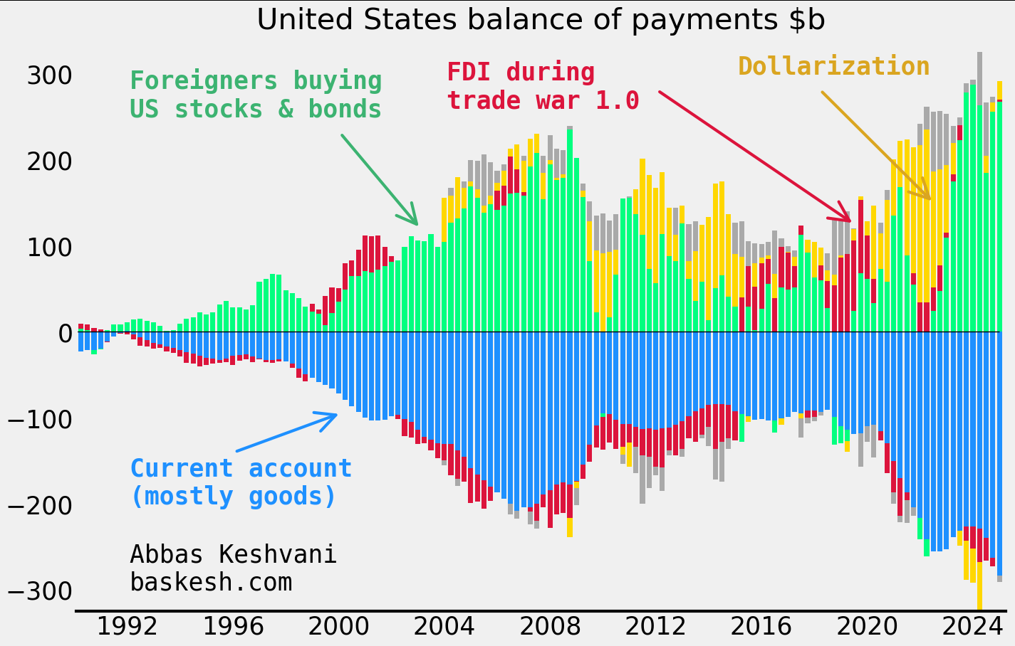
The money does come back eventually… The outflows from America’s goods deficit generally return back to the country via inbound foreign portfolio investment. As a result, the Chinese own 2.8% of outstanding US Treasuries, Koreans own 1.5% of Tesla stock, and so on… We can see this in America’s balance of payments (BOP), which tracks all cross-border flows, visualized in the next chart. US BOP essentially comprises of a wide current account deficit (blue) and large foreign inflows into American stocks and bonds (green).
… But not everyone likes this deal. The administration does not consider America’s BOP dynamic — a current account deficit funded by financial inflows — to be a healthy state of affairs. Robert Lighthizer, the architect of the trade war in the first Trump presidency, describes it as a transfer of wealth to foreigners: “aggressors now own both those assets and the future income of a large segment of the U.S. economy”.
Quarterly data; smoothed four quarters; dollarization includes inflows into US dollar deposit accounts.
What about industrial policy? There are other ways to tackle the good deficit. Tariffs seek to hamper imports. Meanwhile, “industrial policy” or government support of strategic sectors can be used to support exports. But industrial policy, which requires a strong centralized government like China’s, is tricky under America’s fractious political system.
What about a weaker dollar? Another option is to try to weaken the dollar, which would simultaneously support exports and stymie imports. But currency devaluation would carry major geopolitical ramifications for Washington. In any case, whether it is intentional or not, Trump is already pursuing a weaker dollar policy by demanding the Fed cut rates.
Around the same time that the United States experienced its first modern goods deficit in 1971, Nixon upended the international monetary order. He halted the international convertibility of dollars for gold and engineered a devaluation of his currency against those of Germany and Japan. Today’s goods deficit is significantly larger, both in nominal terms and as a share of GDP. It will probably remain a key focus for the White House.
In my last post I forecasted a Trump victory based on him retaining key swing states like Florida, Ohio, Pennsylvania, and Wisconsin (although not Michigan).
But reports of a surge in absentee/mail-in voting signups by Democrats in some of these states raise questions about whether Trump will really be able to hold on to them.
Basics
Mail-in voting is the same as absentee voting. Different states use different terms, but both refer to the same thing: voting using the postal service.
Universal mail-in voting is a sub-category of absentee/mail-in voting, where the state will send every voter a ballot in the mail, whether or not they request one. The voter then has a choice to vote by mail, vote in person, or not vote at all.
Colorado, Hawaii, Oregon, Utah, Washington, California, Nevada, Vermont, and New Jersey have universal mail-in voting. None of these are swing states.
Trump has criticized universal mail-in voting: “Absentee ballots, by the way, are fine… But the universal mail-ins that are just sent all over the place, where people can grab them and grab stacks of them, and sign them and do whatever you want, that’s the thing we’re against.”
Crunching the numbers
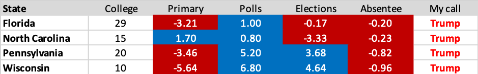
Let’s take a look at the absentee/mail-in data for Florida, Pennsylvania, Wisconsin, and North Carolina, where I noted that the outcome was relatively uncertain.
One of the headline-grabbing figures it that around 650,000 more Democrats have signed up for absentee ballots than Republicans have, indicating that there will be a surge in turnout among Biden voters in November.
But it is important to consider the possible sampling bias at play here:
A Monmouth survey (6-Aug to 10-Aug) reported that 72% of Democrats but only 22% of Republicans were likely to vote by mail
A Pew survey (27-Jul to 2-Aug) showed 58% of Biden supporters would prefer to vote by mail, but only 17% of Trump supporters felt the same way
A TargetSmart survey (21-May to 27-May) showed that 52% of Democrats and 33% of Republicans intended to vote by mail
One of the main reasons for this divide could be that Trump’s rhetoric against mail-in voting has turned usage of the facility into a partisan issue. The bottom line is that using absentee signups to estimate voter turnout could be overestimating the Democrat edge.
Given that Democrats tend to favor absentee voting, for a state like Florida where Democrats and Republicans are roughly matched in numbers, we should expect there to be more Democrats signing up for absentee ballots in that state. In fact I estimate that, ceteris paribus, Democrats should have an edge in absentee ballot signups by around 819,000.
I use numbers of people that voted for either party in 2016 and the respective propensity for voters for each party to sign up for an absentee ballot (conservative 52-33 propensities) to estimate the below expected edges for the Dems:
Numbers for FL and NC are from state governments; using estimates by polling firm TargetSmart for PA and WI
As you can see, although Democrat absentee signups are impressive, for each state they are less than what they should be given the propensity of Democrats to vote by mail anyway. This would indicate that enthusiasm among Democratic voters is weak, a fact I pointed to in my analysis of polling and primary data.
Putting it altogether…
Data for FL and NC from state governments; data for PA and WI from pollster TargetSmart
Florida: Polls are razor-thin, while primary and absentee data suggests lackluster engagement among Democrats.
North Carolina: polling and primary data is very close, while absentee signups for the Democrats are disappointing.
Pennsylvania and Wisconsin: polls show Biden with a decent lead, but less people voted in those states’ Democrat primaries this year than in 2016. In line with my conservative approach, I am giving these states to Trump.
Since my call remains a Trump win with just 289 electoral college votes (306 in 2016), the loss of just Florida to Biden, or any two smaller states from the above table would change the outcome of the election. So I will keep monitoring polling and absentee data (the above table has been updated for polling data) and revise my calls if required.
Timelines: It takes longer to count a mail ballot than a regular one because officials must open thick envelopes, inspect the ballots, and confirm voters’ identities. The large number of people opting for absentee voting may delay the timeline for knowing the outcome of the election. Also, given that Democrats are more likely to use absentee ballots, the initial results we get on polling day are likely to skew the initial outcome in favor of Trump. All of this means we could be in for an “election week” rather than election day, with controversy to follow if the final results differ from those on election day.
If you have questions or feedback, feel free to reach out to me: abbas [dot] keshvani [at] gmail.com.
At the August meeting of the RBI, the Indian central bank kept the repo rate, its benchmark interest rate, unchanged. Around half of economists had expected a policy rate cut (India is in a pandemic after all!). But inflation in the country has exceeded the upper-bound of the RBI’s target range, and a lot of economists correctly forecasted that the central bank would not cut.
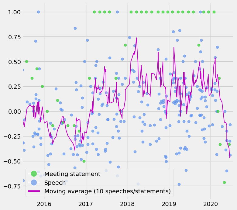
Between speeches, statements, and economic data, there is a lot to track for the RBI. So I have produced an RBI sentiment index in an attempt to objectively quantify and automate the tracking of:
Monetary policy statements (around 4-6 per year)
Speeches (over 20 last year)
CPI prints (12 per year)
Interpretation: The index is a moving average of the last 10 statements/speeches/CPI prints and can oscillate between -1 and +1. A score of +1 means that the RBI sounds optimistic about the economy and inflation is high, so one can reasonably expect the policy rate to be increased. -1 means the RBI sounds pessimistic and that inflation is low, so we can expect rate cuts.
As you can see the index has come off quite a bit since March, mostly due to pessimistic rhetoric as Covid-19 has taken a toll on India’s economy. The index would have fallen further if not for high inflation prints recently. But that is the point: the index should reflect the constraints imposed by inflation (i.e. you can be pessimistic about the economy but unable to cut due to high inflation).
An interesting overlay is between this index and bond yields. Low bond yields indicate that the market expect the central bank to cut rates, but as you can see, the RBI might be thinking differently right now. Even if you look past high inflation, some of the recent speeches and the August meeting statement show an improvement in RBI sentiment.
Details of the index:
NLP to automate scoring of rhetoric:I have used Python to automate the process of scraping all speeches and scoring them on a scale of -1 (pessimistic about the economy) to +1 (optimistic). While I was at it, I also did the same process for all RBI statements. The methodology is explained in more detail here.
Adding inflation data to the mix: I was worried that RBI speeches and statements were not adequately discussing inflationary pressure. This is particularly problematic for a country like India, which dealt with double digit inflation as recently as 2013 and where the CPI index has swung from 2.1% in January 2019 to 6.9% in July 2020. Compare that to the US, where core PCE inflation has mostly observed a humble range of 1-2%.
Members of the Federal Open Market Committee, the body which decides the Fed’s interest rate policy, have their words closely scrutinized for hints about what the next policy change could be. Aside from the official policy-setting meetings (around eight per year), FOMC members give speeches throughout the year (78 in 2019).
Here I use natural-language processing (NLP) to assign a score to each of those speeches, as well as official FOMC statements.
As expected, the index shows that recent Fed speeches have been relatively negative in their tone.
Method:
The formula I use to calculate a speech’s score is based off the number of positive words and negative words in that speech/statement.
A score of +1 means that a speech had only positive words like “efficient”, “strong” and “resilient”, while -1 means it had only negative words like “repercussions”, “stagnate”, and “worsening”. The dictionary I use to determine whether a word is positive is based off (I have modified it) a 2017 paper published by the Federal Reserve Board1.
One also has to account for negation. A statement like “growth is not strong” has a positive word in it (“strong”) which should actually be counted as a negative word. As such, if a positive word is within three words of a negation word like “not” or “never”, then it is treated as a negative word. On the other hand, a negative word near a negation word (“growth is not poor”) is simply not counted, rather than treated as a positive word.
I downloaded the speeches and statements, did the NLP analysis, and produced the charts on Python.
Relation with yields:
Here I chart the Fed sentiment index against the US 2y yields, as well as the sentiment scores of the official meeting statements. The index moved higher from late 2016 to early 2018 as the Fed started hiking policy.
However in early 2018 the sentiment index indicated that the Fed had turned less positive, but yields continued moving higher as the hiking cycle continued. It is also important to note that sometimes a shift in FOMC thinking/language drives market price-action, and sometimes it is the other way round, so one cannot expect the index to always presage higher or lower yields.
As we go into the September FOMC meeting, where some people are expecting the Fed to announce yield curve control, keeping an objective eye on Fed sentiment will become even more important.
1Correa, Ricardo, Keshav Garud, Juan M. Londono, and Nathan Mislang (2017) – Sentiment in Central Banks’ Financial Stability Reports. International Finance Discussion Papers 1203.
Following my recent post about the most referenced topic in FX commentary (in my case, excellent daily commentary from BNZ), I received a number of questions from readers about whether topic X was being talked about more or less.
So I visualized the data differently for all those interested – this time as time series. Each chart show the number of references made to a particular topic on a monthly basis.
References to the trade war, Fed and Trump increased in May. Meanwhile references to Covid-19 have been consistently sliding lower every month since March.
See last post for methodology. Everything done on Python.
An updated version of this chart for June 2020 was shared with subscribers of TLR Wire, the esteemed economics newsletter managed by Philippa Dunne and Doug Henwood.
The financial sector produces a lot of commentary on the things affecting markets. A lot of this year’s commentary has been focused on Covid-19, but before that there was a lot of literature being produced on the US-China trade war and Brexit.
Here I chart, for every month, the most talked about issue in financial literature. I did this by pulling out hundreds of daily FX commentary pieces from BNZ (who do a solid job on recapping the previous day’s events) and analyzing the most used words (excluding the generic ones like “the” and “markets” and “economy”).
Naturally the total number of references to Covid-19 for a given month is not just the number of times “Covid-19” is printed, but also “coronavirus” and “virus”. A similar methodology is adopted for the US-China trade war.
While Covid-19 remained in the top 5 of topics for May, we can see the focus is starting to balance out, with the the Fed getting the most number of references as we approach the June meeting (which will have the Fed’s quarterly economic projections (which they skipped in March). There was also a pick-up in references to “Trump” and “trade” this month, suggesting that we aren’t quite done with the US-China theme.
Data mining, text-analysis and chart all done on Python.
The Federal Reserve (or “Fed”) is the central bank of the United States, in charge of setting interest rates, regulating banks, maintaining the stability of the financial system, and providing financial services such as swap lines (which temporarily provide foreign central banks with dollars).
The Fed has its own balance sheet, which means its owns assets such as US government bonds (“Treasuries”) and has liabilities such as reserves (cash which financial institutions keep with the Fed) and currency (which technically counts as a liability because the Fed “owes” you things for the dollars you hold – historically it was gold, but now it is other assets such as bonds).
In the aftermath of the Great Recession from 2008, the Fed undertook Quantitative Easing (QE), which means it created new money to buy bonds and loans. This increased its balance sheet from roughly $1 trillion in 2008 to $4.5 trillion in 2014.
From 2014 to 2018, the Fed stopped buying additional bonds and loans under QE, and its balance sheet stabilized.
From 2018 to 2019, the Fed started to sell some of its assets, but this only reduced the balance sheet to around $3.8 trillion.
Around the Covid-19 outbreak, the Fed started buying assets again and also temporarily provided dollars to other central banks. This has ballooned the Fed’s balance sheet to around $6.6 trillion today.
In my last post, I talked about how America had depressed oil prices by increasing its supply. Recall this graph which shows that the supply glut is primarily caused by increased American supply (the top pink line is America):
The glut is mostly due to America producing more oil
Since low prices are mainly caused by American oversupply, a decrease in American supply will have a major impact on prices. And it does look like American supply might wind down. The next graph shows how American oil production responds (eventually) to the number of oil rigs in America.
Just to clarify, “rigs” here refers to rotary rigs – the machines that drill for new oil wells. The actual extraction is done by wells, not rigs. But American oil supply shows a remarkable (lagged) covariance with rig count. From the 1990 to 2000, the number of rigs decreased, and oil supply followed it down. Then, when the number of rigs jumped in 2007, oil supply also rose with it.
Note that the number of American rigs has plummeted since the start of 2015. It is no coincidence that oil prices hit a record low in January 2015. At these paltry prices, oil companies have less of an impetus to dig for more oil.
The number of oil rings in America has halved since January 2015
The break-even price for shale oil varies according to the basin (reservoir) it comes from. A barrel from Bakken-Parshall-Sanish (proven reserves: 1 billion barrels) costs $60, while a barrel from Utica-Condensate (4.5 billion barrels) costs $95. The reserve-weighted average price is $76.50. These figures were calculated by Wood McKenzie, an oil consulting firm, and can be viewed in detail here.
As the number of rigs has halved to 800, the United States will not be able to keep up its record supply. Keep in mind that wells are running dry all the time, so less rigging will eventually mean less oil. Perhaps finally, the glut is about to end, with consequences for oil prices. To put things in perspective, the last time America had only 800 rigs (end January 2011), oil was at $97 a barrel.
Oil probably will not return to $100 a barrel. If it does, shale oil will become profitable again (the threshold is $76), American rigs will come online again, supply will increase and prices will come down again. So oil will have to find a new equilibrium price to be stable. A reasonable level to expect for this equilibrium is around $70, the break-even price for shale.
There will probably be a lag in the reduction of American supply: Note how oil supply does not immediately respond to the number of rigs. But things move faster when expectations are at play. On the 6th of April, traders realized Iranian rigs were not going to come online as fast as they thought. Oil prices rose 5% in one night. American supply does not have to come down for prices to drop: traders simply have to realize prices will come down.
Data from US Energy Information Agency and Baker Hughes, an oil rig services provider. Graphs plotted on R.
This article was republished by the Significance, the official magazine of the American Statistical Association and Royal Statistical Society (UK).
You have probably heard that the price of crude oil has tumbled from $115 per barrel (159 litres, an archaic but established unit of measurement) in June 2014 to $54 in March 2015.
The price of oil has halved in 9 months.
Why oil has plunged so far: The drop has been caused by a supply glut (oversupply), as the below graph shows. The top line in pink is America, not Saudi Arabia:
The glut is mostly due to America producing more oil.
Although most of us think of Saudi Arabia as the world’s largest oil supplier, in actual fact the United States has had this title since 2013. In 2014, America was responsible for around half of the net increase in world oil output, due to a boom in the shale gas industry there. Its increase was akin to adding one Kazakhstan to the world! All of this excludes all the natural gas the US got out of fracking, which also makes it the #1 gas supplier.
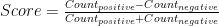
Historically, Saudi Arabia has played a stabilizing role in world oil prices, by adjusting its output to ensure global supply is stable. The below graph show how Saudi output increased to lower prices when they were high, and vice versa. However, since July, the Saudis have not responded to newly low oil prices by decreasing output. In fact, the Kingdom have insisted that they would rather bear lower oil prices than decrease their market share (read: be squeezed out by shale).
The Saudis have historically stabilized prices, but no more.
Saudi Arabia is backed by the other members of the Gulf Cooperation Council – UAE, Qatar and Kuwait. Together, the GCC are responsible for more than a fifth of world oil output, so their inaction towards falling prices has been instrumental in ensuring that oil prices remain low. But why have the Saudis and their allies been so passive?
Motive 1 – Shale: One reason the Kingdom is depressing prices is to thwart the growth of the nascent shale gas and bitumen oil industries in America and Canada. The threat from these new industries to Saudi Arabia is real – In October, America ceased Nigerian oil imports, even though Nigeria exported almost as much oil to America as Saudi Arabia as recently at 2010. Meanwhile, Canada steadily increased its exports of bitumen oil to America during the same period.
However, new shale projects require $65 oil to break even. At $53 a barrel, the shale boom has been paused, and several investments have been called off, their returns in doubt (although many existing wells remain online). If the Saudis allow prices to increase, the threat of shale will likely resume, so it does not look like they will allow prices to return to their pre-June levels. But the current price level is sufficiently low to keep the threat at bay, so the Saudis need not increase output further. At the same time, $53 oil will stop new shale projects from coming offline, so it is unlikely that North America can contribute to the supply glut any further, either. It is for these reasons that oil proces are unlikely to tumble much further.
Motive 2 – Iran: However, I believe the Saudis have also depressed prices to hurt Iran and Russia, both of whom make most of their export revenue from oil. Iran’s expanding influence in the Middle East has rattled the Saudis considerably. In addition, both Iran and Russia remain staunch defenders of the Syrian government, which the Saudis and Qataris despise. The Saudi’s reserves of $900bln provide the kingdom with a buffer, but will likely force Iran and Russia to think twice about expensive foreign projects like Syria, right?
But it does not look like low oil prices have reduced Iranian, or even Russian, involvement in Iraq and Syria. Iranian General Soleimani is openly marching through Iraq as an “advisor”, while Iran-backed militia have made the bulk of gains against IS. Meanwhile Assad has held onto power, two years after most media outlets pronounced him as good as overthrown. All of this has happened against the backdrop of low oil prices. Thus, it does not look like there is much value in continuing the Saudi strategy of depressing oil prices to curb Iranian influence.
Other producers, like Nigeria: The second graph shows that other oil producers like Nigeria (produces 2.3m barrels a day or 2.6% of world oil: more than Qatar but less than UAE) have generally kept output constant. Most major oil producers – nations like Nigeria, Venezuela and Iraq – cannot afford to decrease oil sales, which are critical to their economies. They are probably not too happy about low oil prices, but have little choice in the matter. Finally, fortunately or unfortunately, the conflict in Libya has not depressed their oil output.
Wild card Iran: Iran exported 3m barrels of oil per day in 2006, and sanctions have reduced this number to a meager 1.2m per day. A barrage of nuclear-related sanctions since 2006 have imposed an embargo on Iranian oil exports to the EU, prohibited investments in Iran’s oil industry, and barred banks from mediating transactions involving Iranian oil. But as sanctions are eased, Iran’s oil exports will certainly increase, and this may lower prices even further.
However, the timelines for increased Iranian oil exports are unclear. They depend on the speed at which sanctions are repealed and the pace at which Iran can ramp-up output: The timelines for repealing nuclear-related sanctions imposed by the P5+1 will only be unveiled on 30thJune 2015; Iran has 30m barrels of oil ready to ship out immediately, but beyond this stockpile, it will takes years for Iran to bring its oil industry up to speed.
If sanctions are eased and Iran increases oil exports within a year, Saudi Arabia may actually reduce their output. Allowing prices to drop further will not serve the kingdom’s interests. Current prices are already low enough to keep shale at bay. The kingdom could very well lower prices to hurt Iran, but low oil prices do not seem to have worked to curb Iranian influence so far.
Any Iran-related decreases in oil prices will also be bound by the $50 psychological resistance (although this was breached in January) and the 2008 low of $34.
In summary, I do not think will see $100 oil any time soon, but I also do not think oil prices will drop much further than they already have.
Data from US Energy Information Administration; graphs produced on R.
South Koreans earn, on average, $33,140 per year (PPP), making them almost as rich as Britons. However, Koreans also work 30% more hours than Britons, making their per-hour wage considerably less than a British wage. In fact, the Korean wage of $15 per hour (PPP) is comparable to that of a Czech or Slovakian.
Here is a map of the working hours of mostly OECD countries.
Hours worked per week
As you can see, people in developing countries have to work longer hours. The exception is South Korea, which works pretty hard for a rich country – harder than Brazil and Poland do. If you divide per-capita income by working hours, you get a person’s hourly wage:
World Wide Wage
The top 10 earners by wage are mostly northern Europeans – Norway, Germany, Denmark, Sweden, Switzerland, Netherlands – and small financial centres Singapore and Luxembourg. As the first to industrialize, Europeans found they were able to mechanize ploughing, assembling and number-crunching – boosting incomes, while simultaneously decreasing working hours.
The bottom earners are developing countries – such as Mexico, Brazil and Poland. Again, Korea stands out as a rich country with low wages. This could be because Korea exported their way into prosperity by winning over Western consumers from the likes of General Motors and General Electric. They did this by combining industrialization with low wages, which are therefore responsible for the ascent of their economies.
Data from World Bank, OECD, and BBC. Maps created on R.
On the 18th of September 2014, Scottish people will vote on secession from the United Kingdom, potentially ending a union that has existed since 1707. If Scots vote “Yes” to end the union, the United Kingdom will consist of England, Wales and Northern Ireland, while the newly created country of Scotland may look like this:
Basically, Scotland would look a lot like Finland. The two countries have similar populations, GDP, and even their respective largest cities are about the same size.
India conducted general elections between 7th April and 12th May , which elected a Member of Parliament to represent each of the 543 constituencies that make up the country.
The opposition BJP won 31% of the votes, which yielded them 282 out of 543 seats in parliament, or 52% of all seats. The BJP allied with smaller parties, such as the Telugu Desam Party, to form the National Democratic Alliance (NDA). Altogether, the NDA won 39% of the votes and 336 seats (62%).
India’s parties, topped up by their allies
Turnout was pretty good: 541 million Indians, or 66% of the total vote bank, participated in the polls.
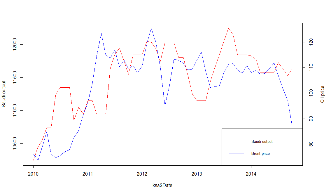
Google and Bing both performed excellent analytics on the election results, but I thought Bing’s was easier to use since their visual is a clean and simple India-only map. They actually out-simpled Google this time.
Bing: A constituency is more likely to elect BJP (orange) if its people speak Hindi
Interestingly, the BJP’s victories seem to come largely from Hindi speakers, traditionally concentrated in the north and west parts of India. Plenty of non-Hindi speakers voted for the BJP too, such as in Gujarat and Maharashtra, but votes in south and east of the country generally went to a more diverse pantheon of parties.
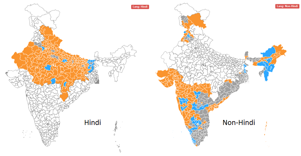
In my experience, central London is generally a safe place, but I was robbed there two years ago. A friend and I got lost on our way to a pancake house (serving, not made of), so I took my new iPhone out to consult a map. In a flash, a bicyclist zoomed past and plucked my phone out of my hands. Needless to say, I lost my appetite for pancakes that day.
But I am far from alone. Here, I have plotted 506 instances of theft, violence, arson, drug trade, and anti-social behaviour onto a map of London. The data I am using only lists crimes in the City of London, a small area within central London which hosts the global HQs of many banks and law firms, for the month of February 2014.
Crime in the City of London – February 2014
Each point on this map is not a single instance of crime – recall that the data lists over 500 instances of crime. So, each point corresponds to multiple instances of crime which happened at a particular spot. So, it is probably best to split the map into hexagons (no particular reason for my choice of shape) which are colour coded to explain how dense the crime in that area is.
Heatmap of crime in Central London – Feb 2014
A particular hotspot for crime appears to be the area around the Gherkin, or 30 St Mary’s Axe, Britain’s most expensive office building.
Data from data.police.uk; Graphics produced on R using ggplot2 package; Map from Google maps.
For all the flak China receives about its greenhouse gas emissions, the average Chinese produces less than a third the amount of CO2 than his American counterpart. It just so happens that there are 1.3 billion Chinese, and 0.3 billion Americans, so China ends up producing more CO2.
Carbon dioxide and other greenhouse gases, such as methane and carbon monoxide, are produced from burning petrol, growing rice, and raising cattle . These greenhouse gases let in sun rays, but do not let out the heat that the rays generate on earth. This results in a greenhouse effect, where global temperatures are purported to be rising as a result of human activities.
The below map shows the per-capita emissions of greenhouse gases:
Greenhouse Gas Emissions per capita
As you can see, the least damage is done by people in Africa, South Asia, and Latin America. But these places also happen to be the poorest places: Because they don’t have much industry, they don’t churn out much CO2.
The below plot shows the correlation between poverty and green-ness. As you can see, each dollar of a rich person is attached to a smaller carbon cost than the dollar of a poor person. This is partially because rich people get most of their manufacturing done by poor people, but also because rich people are more environmentally conscious.
Plot: CO2 per Dollar vs. GDP per capita
Lastly, here is a map of CO2 emissions per dollar of GDP, which shows how green different economies are:
CO2 Emissions per Dollar
CO2 emissions per Dollar of output are lowest in:
EU and Japan: highly regulated and environmentally conscious
sub-Saharan Africa: subsistence-based economies
…and highest in the industrializing economies of Asia.
Kudos to Brazilian output for being so green, despite the country’s middle-income status. Were these statistics to factor in the CO2 absorption from rainforests, Brazil and other equatorial countries would appear even greener.
The QS Rankings are an influential score sheet of universities around the world. They are published annually by Quacquarelli Symonds (QS), a British research company based in London. The rankings for 2013 are out, and I have charted the rankings of this year’s top 10 over the last five years:
QS’s top 10 from 2008 to 2013; The label is the 2013 rank. Columbia is included because it was in the top 10 of 2008 and 2010.
Observations from this year’s ranking:
MIT (#1 in 2013) has shot up in the rankings. This is in line with the increasing demand for technical and computer science education. At Harvard, enrollment into the college’s introductory computer science course went up, from around 300 students in 2008 to almost 800 students in 2013!
Asia’s top scorer is National University of Singapore
Method:
Method: How QS Ranks Universities
The QS Rankings produce an aggregate score, on a scale of 0-100, for each university. The aggregate score is a sum of six weighted scores:
Academic reputation: from a global survey of 62,000 academics (40%)
Student:Faculty ratio (20%)
Citations per Faculty: How many times the university’s research is cited in other sources on Scopus, a database of research (20%)
Employer reputation: from a global survey of 28,000 employers (20%)
Int’l Faculty (Students): proportion of faculty (students) from abroad (5% each)
Note that many of the universities are apart by tiny numbers (MIT, Harvard, Cambridge, UCL, Imperial are all within 1.3 points of each other), which increases the likelihood of bias or error influencing the ranking.
In any case, it appears futile to try and compare massive multi-disciplinary institutions by a single statistic.
However, larger trends – like MIT’s and Stanford’s ascendancy – are noteworthy.
In America, the richest 1% of households earned almost 20% of the income in 2012, which points to a very wide income gap. This presents many social and economic problems, but also a statistical problem: what is the “average” American’s salary?
This average is often reported as GDP per capita: the mean of household incomes. In 2011, the mean household earned $70,000. However, the majority of Americans earned well below $70K that year. The reason for this misrepresentation is rich people: In 2011, Oracle CEO Larry Ellison made almost $100 million, alone adding a dollar to each household’s income, were his salary distributed among everyone – as indeed the mean makes it appear it is.
Here is a graphic of American inequity:
Income Distribution in America: the blue part of the last bar represents the earnings of the top 5% of households
As you can see, the mean would not be such a poor representation (or rich representation) of the average salary if we discounted the top 5%.
In fact, the trimmed mean removes extreme values before calculating the mean. Unfortunately, the trimmed mean is not widely used in data reporting by the agencies that report incomes – the IRS, Bureau of Economic Analysis and the US Census.
In this case, the median is a much better average. This is simply the income right in the middle of the list of incomes.
American Household Income: the Mean is much higher than the Median
As you can see, whether you use the Mean or Median makes a very big difference. The median household income is $20,000 lower than the mean household income.
Of course, America is not the only country with a wide economic divide. China, Mexico and Malaysia have similar disparities between rich and poor, while most of South America and Southern Africa are even more polarized, as measured by the Gini coefficient, a measure of economic inequality.
Data from the US Census. Available income data typically lags by two years, which is why graphs stop at 2011; 2012 Data is projected. Graphics produced on R.
The Current Account Balance is a measure of a country’s “profitability”. It is the sum of profits (losses) made from trading with other countries, profits (losses) made from investments in other countries, and cash transfers, such as remittances from expatriates.
World: Current Account Balance, 2010
As the infographic shows, there isn’t much middle ground when it comes to a current account balance. Most countries have:
large deficits (America, most of Europe, Australia, Brazil, India)
large surpluses (China, most of Southeast Asia, Northern European countries, Russia, Gulf oil producers).
There are a few countries with
small deficits (most Central American states, Pakistan)
small surpluses (most Baltics)
…but they are largely outnumbered by the clear winners and losers of world trade.
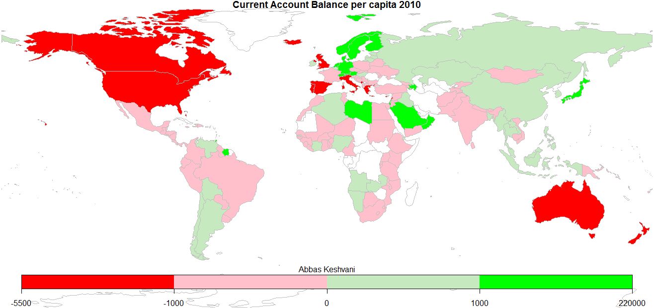
The above is not a per-capita infographic, so larger countries tend to be clear winners or losers, while smaller countries are more likely to straddle the divide. Here is the per-capita Current Account Balance map:
World: Current Account Balance per capita, 2010
This can be interpreted as how much people around the world earn from eachother:
Anglophones (people in America, Canada, UK, Australia) chock up some of the biggest deficits, as do people in the Mediterranean
Oil producers (Saudis, Libyans, Norwegians) profit the most off trade, as do industrious Germans and Japanese. I sense an automobile theme
Most of us are somewhere in the middle
Records: Icelanders have the biggest deficits, Singaporeans the biggest surpluses
On the topic of English-speakers running deficits, here is a recent BBC article that explores the link between the English language and the act of saving money.
2010 Current Account Balance and Population data from World Bank; graphics produced on R.