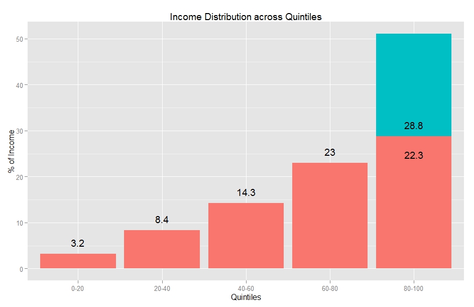
In America, the richest 1% of households earned almost 20% of the income in 2012, which points to a very wide income gap. This presents many social and economic problems, but also a statistical problem: what is the “average” American’s salary?
This average is often reported as GDP per capita: the mean of household incomes. In 2011, the mean household earned $70,000. However, the majority of Americans earned well below $70K that year. The reason for this misrepresentation is rich people: In 2011, Oracle CEO Larry Ellison made almost $100 million, alone adding a dollar to each household’s income, were his salary distributed among everyone – as indeed the mean makes it appear it is.
Here is a graphic of American inequity:

As you can see, the mean would not be such a poor representation (or rich representation) of the average salary if we discounted the top 5%.
In fact, the trimmed mean removes extreme values before calculating the mean. Unfortunately, the trimmed mean is not widely used in data reporting by the agencies that report incomes – the IRS, Bureau of Economic Analysis and the US Census.
In this case, the median is a much better average. This is simply the income right in the middle of the list of incomes.

As you can see, whether you use the Mean or Median makes a very big difference. The median household income is $20,000 lower than the mean household income.
Of course, America is not the only country with a wide economic divide. China, Mexico and Malaysia have similar disparities between rich and poor, while most of South America and Southern Africa are even more polarized, as measured by the Gini coefficient, a measure of economic inequality.
Data from the US Census. Available income data typically lags by two years, which is why graphs stop at 2011; 2012 Data is projected. Graphics produced on R.
Household income isn’t a very reliable way to look at income distribution in the United States. This is from Thomas Sowell’s Economic Facts and Fallacies.
I read this book a couple of years ago and I’ve noticed since then that many of the “income distribution” stories are based on household income. The number of people living in a household has changed dramatically from 1900-1950-2000.
Hi Henshaw,
Thanks for the feedback! Your concerns about the tenability of household income as a gauge are valid; I share many of these concerns with you. However, I used household data for two main reasons:
1) Practical: Household data is more readily available, at least if you want data that spans decades. Having said that, please share any sources of per capita data you are aware of.
2) Principal: Societies tend to earn and consume as family units. Certainly, the size of a family unit is highly variable, which means we do not know how many people share that income. But there is an average family size we can use.
On the other hand, per capita income is not without shortcomings. A family may be made up of 3 people, and the per capita income may be 50K, but that does not necessarily translate into a household income of 150K, or even 100K. So, the per capita income does not tell us how much money each member of this family has access to.
Keep visiting and commenting!
Abbas
I just discovered your blog and all your case studies are so nicely explained! I would really want to get to this stage with my analytics. I have just started using clustering, forecasting, decision trees etc using R. When ever I have issues with my models and I do more research, I get overwhelmed with the stats behind it. I have taken basic stats courses with t test, f test, ANOVA and regression etc.. And good recommendations for stats textbook which are easy to understand like your blogs?
Thanks! I started this blog partly because I found textbooks so confusing, and wanted to help others who felt the same way.
That’s not to say there are no good textbooks. I just did not find them during my time at uni.