In my experience, central London is generally a safe place, but I was robbed there two years ago. A friend and I got lost on our way to a pancake house (serving, not made of), so I took my new iPhone out to consult a map. In a flash, a bicyclist zoomed past and plucked my phone out of my hands. Needless to say, I lost my appetite for pancakes that day.
But I am far from alone. Here, I have plotted 506 instances of theft, violence, arson, drug trade, and anti-social behaviour onto a map of London. The data I am using only lists crimes in the City of London, a small area within central London which hosts the global HQs of many banks and law firms, for the month of February 2014.

Each point on this map is not a single instance of crime – recall that the data lists over 500 instances of crime. So, each point corresponds to multiple instances of crime which happened at a particular spot. So, it is probably best to split the map into hexagons (no particular reason for my choice of shape) which are colour coded to explain how dense the crime in that area is.
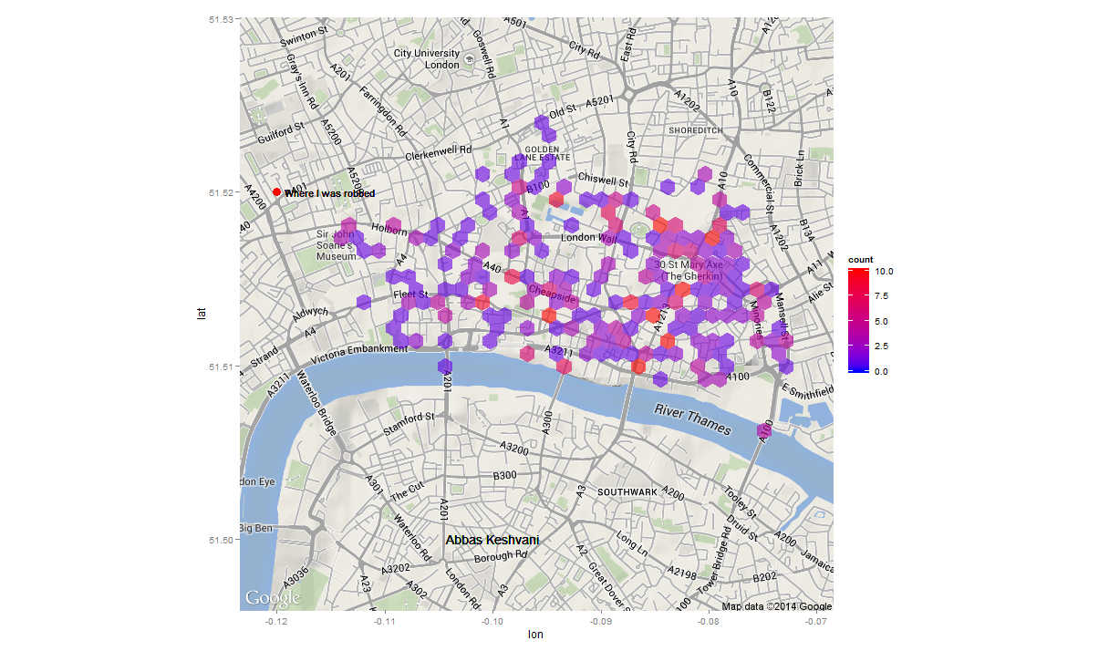
A particular hotspot for crime appears to be the area around the Gherkin, or 30 St Mary’s Axe, Britain’s most expensive office building.
Data from data.police.uk; Graphics produced on R using ggplot2 package; Map from Google maps.

Well written article. Good representation of data. To split up the data into instances of crime in a particular spot and then the corresponding crime density makes it easier to understand the data from a layman’s persepctive. Good going Abbas, expecting more articles from you in the future.
Thanks Khuddoos! And I expect more of your excellent feedback for the posts to come.