Say you have a dataset, where each row has a date or time, and something is recorded for that date and time. If each row is a unique date – great! If not, you may have rows with the same date, and you have to combine records for the same date to get a daily tally.
Here is how you can make a daily tally (or a monthly or yearly one; the frequency of tallies is not important):
convert the dates to numbers. R will say 01/01/1970 is day 1, 02/01/1970 is day 2, …, 07/03/2010 is day 14675; 31/12/1960 is day -1.
use a “for loop” to lump entries from the same date together
calculate the daily by calculating the number of rows in the daily lump (I do this below), or by adding all entries in a particular column in a daily lump
for(i in 1:184) #my data spans 184 days from 7th March to 6th Sept 2010
{
rott.i<-rott[rott[,2]==14674+i,] daily[i,1]<-nrow(rott.i) #7th March 2010 is the 14675th day from 01/01/1970, the day the R calendar starts
}
acf(daily,main=”Autocorrelation of Timeseries”) #ACF!
There are different types of data on R. I use type here as a technical term, rather than merely a synonym of “variety”. There are three main types of data:
Numeric: ordinary numbers
Character: not treated as a number, but as a word. You cannot add two characters, even if they appear to be numerical. Characters have “inverted commas” around them.
Date: can be used in time series analysis, like a time series plot.
To diagnose the type of data you’re dealing with, use class()
You can convert data between types. To convert to:
Numeric: as.numerical()
Character: as.character()
Date: as.Date()
Note that to convert a character or numeric to a date, you may need to specify the format of the date:
ddmmyyyy: as.Date(x, format=”%d%m%Y”) *default, so format needn’t be specified
mmddyyyy: as.Date(x, format=”%m%d%Y”)
dd-mm-yyyy: as.Date(x, format=”%d-%m-%Y”)
dd/mm/yyyy: as.Date(x, format=”%d/%m/%Y”)
if the month is named, like 12February1989: as.Date(x, format=”%d%B%Y”)
if the month is short-form named, like 12Feb1989: as.Date(x, format=”%d%b%Y”)
if the year is in two digit form, like 12Feb89: as.Date(x, format=”%d%m%y”)
if the date in mmyyyy form: as.yearmon(x, format=”%m%Y”) *from zoo package
if date includes time, like 21/05/2012 21:20:30: as.Date(x, format=”%d/%m/%Y %H:%M:%S)
Suppose you have decided on a suitable model for a timeseries. In this case, we have selected an ARIMA(2,1,3) model, using the Akaike Information Criteria (AIC) as our sole criterion for choosing between various models here, where we model the DJIA.
Note: There are many criteria for choosing a model, and the AIC is only one of them. Thus, the AIC should be used heuristically, in conjunction with t-tests and the Coefficient of Determination, among other statistics. Nonetheless, let us assume that we ran all these tests, and were still satisfied with ARIMA(2,1,3).
An ARIMA(2,1,3) looks like this:
This is not very informative for forecasting future reaizations of a timeseries, because we need to know the values of the coefficients , , etcetera. So we use R’s arima() function, which spits out the following output:
ARIMA(2,1,3): Coefficients
Thus, we revise our model to:
Then, we can forecast the next, say 20, realizations of the DJIA, to produce a forecast plot. We are forecasting values for January 1st 1990 to January 26th 1990, dates for which we have the real values. So, we can overlay these values on our forecast plot:
Forecast: Predicted range (shaded in light grey for 95% confidence, dark grey for 80% confidence) and Actual Values (red)
Note that the forecast is more accurate for predicting the DJIA a few days ahead than later dates. This could be due to:
the model we use
fundamental market movements that could not be forecasted
Which is why data in a vacuum is always pleasant to work with. Next: Data in a vacuum. I will look at data from the biggest vacuum of all – space.
The Akaike Information Critera (AIC) is a widely used measure of a statistical model. It basically quantifies 1) the goodness of fit, and 2) the simplicity/parsimony, of the model into a single statistic.
When comparing two models, the one with the lower AIC is generally “better”. Now, let us apply this powerful tool in comparing various ARIMA models, often used to model time series.
The dataset we will use is the Dow Jones Industrial Average (DJIA), a stock market index that constitutes 30 of America’s biggest companies, such as Hewlett Packard and Boeing. First, let us perform a time plot of the DJIA data. This massive dataframe comprises almost 32000 records, going back to the index’s founding in 1896. There was an actual lag of 3 seconds between me calling the function and R spitting out the below graph!
Dow Jones Industrial Average since March 1896But it immediately becomes apparent that there is a lot more at play here than an ARIMA model. Since 1896, the DJIA has seen several periods of rapid economic growth, the Great Depression, two World Wars, the Oil shock, the early 2000s recession, the current recession, etcetera. Therefore, I opted to narrow the dataset to the period 1988-1989, which saw relative stability. As is clear from the timeplot, and slow decay of the ACF, the DJIA 1988-1989 timeseries is not stationary:
Time plot (left) and AIC (right): DJIA 1988-1989So, we may want to take the first difference of the DJIA 1988-1989 index. This is expressed in the equation below:
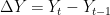
The first difference is thus, the difference between an entry and entry preceding it. The timeseries and AIC of the First Difference are shown below. They indicate a stationary time series.
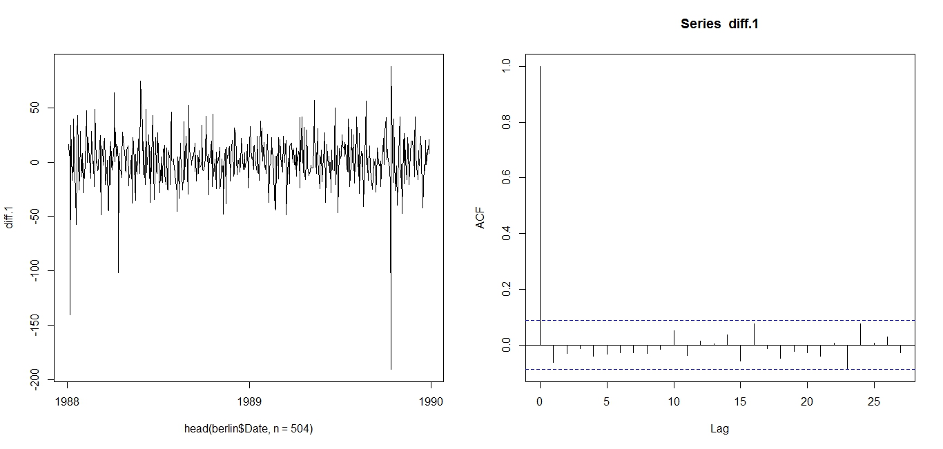
First Difference of DJIA 1988-1989: Time plot (left) and ACF (right)Now, we can test various ARMA models against the DJIA 1988-1989 First Difference. I will test 25 ARMA models: ARMA(1,1); ARMA(1,2), … , ARMA(3,3), … , ARMA(5,5). To compare these 25 models, I will use the AIC.
Table of AICs: ARMA(1,1) through ARMA(5,5)I have highlighted in green the two models with the lowest AICs. Their low AIC values suggest that these models nicely straddle the requirements of goodness-of-fit and parsimony. I have also highlighted in red the worst two models: i.e. the models with the highest AICs. Since ARMA(2,3) is the best model for the First Difference of DJIA 1988-1989, we use ARIMA(2,1,3) for DJIA 1988-1989.
The AIC works as such: Some models, such as ARIMA(3,1,3), may offer better fit than ARIMA(2,1,3), but that fit is not worth the loss in parsimony imposed by the addition of additional AR and MA lags. Similarly, models such as ARIMA(1,1,1) may be more parsimonious, but they do not explain DJIA 1988-1989 well enough to justify such an austere model.
Note that the AIC has limitations and should be used heuristically. The above is merely an illustration of how the AIC is used. Nonetheless, it suggests that between 1988 and 1989, the DJIA followed the below ARIMA(2,1,3) model:
Next: Determining the above coefficients, and forecasting the DJIA.
Analysis conducted on R. Credits to the St Louis Fed for the DJIA data.
In my previous post, I wrote about using the autocorrelation function (ACF) to determine if a timeseries is stationary. Now, let us use the ACF to determine seasonality. This is a relatively straightforward procedure.
Firstly, seasonality in a timeseries refers to predictable and recurring trends and patterns over a period of time, normally a year. An example of a seasonal timeseries is retail data, which sees spikes in sales during holiday seasons like Christmas. Another seasonal timeseries is box office data, which sees a spike in sales of movie tickets over the summer season. Yet another example is sales of Hallmark cards, which spike in February for Valentine’s Day.
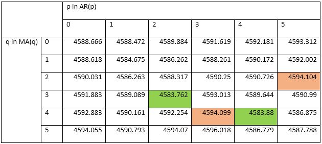
The below graphs show sales of clothing in the UK, and how these sales follow seasonal trends, spiking in the holiday season:
Clothing Sales in the UKClothing Sales in the UK: line graph
Note the spikes in sales, which obediently occur every December, in time for Christmas. This is evident in the trail of December plot points (Graph 1), which hover significantly above the sales data for other months, and also in the actual spikes of the line graph (Graph 2).
The above is a simple example of a seasonal timeseries. However, timeseries are not always simply seasonal. For example, a SARMA process comprises of seasonal, autoregressive, and moving average components, hence the acronym. This will not look as obviously seasonal, as the AR and MA processes may overlap with the seasonal process. Thus, a simple timeseries plot, as shown above, will not allow us to appreciate and identify the seasonal element in the series.
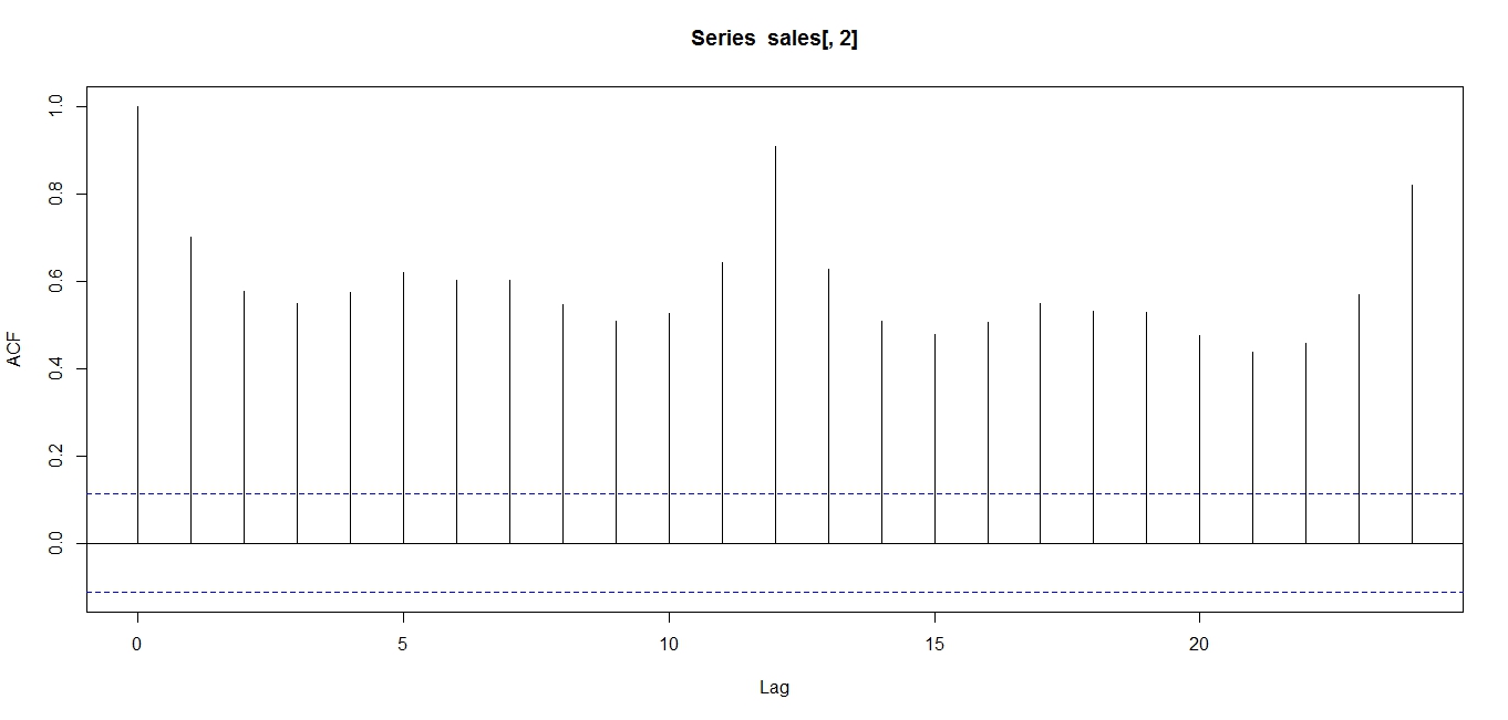
Thus, it may be advisable to use an autocorrelation function to determine seasonality. In the case of seasonality, we will observe an ACF as below:
ACF of UK clothing sales data
Note that the ACF shows an oscillation, indicative of a seasonal series. Note the peaks occur at lags of 12 months, because April 2011 correlates with April 2012, and 24 months, because April 2011 correlates with April 2013, and so on.
The above analyses were conducted on R. Credits to data.gov.uk and the Office of National Statistics, UK for the data.
The Autocorrelation function is one of the widest used tools in timeseries analysis. It is used to determine stationarity and seasonality.
Stationarity:
This refers to whether the series is “going anywhere” over time. Stationary series have a constant value over time.
Below is what a non-stationary series looks like. Note the changing mean.
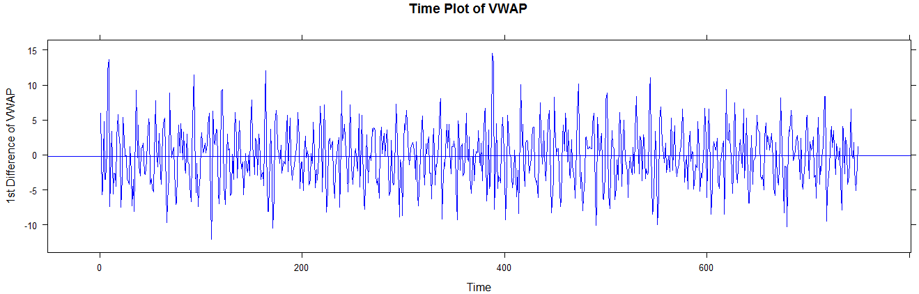
Time series plot of non-stationary seriesAnd below is what a stationary series looks like. This is the first difference of the above series, FYI. Note the constant mean (long term).
Stationary series: First difference of VWAPThe above time series provide strong indications of (non) stationary, but the ACF helps us ascertain this indication.
If a series is non-stationary (moving), its ACF may look a little like this:
ACF of non-stationary seriesThe above ACF is “decaying”, or decreasing, very slowly, and remains well above the significance range (dotted blue lines). This is indicative of a non-stationary series.
On the other hand, observe the ACF of a stationary (not going anywhere) series:
ACF of stationary seriesNote that the ACF shows exponential decay. This is indicative of a stationary series.
Consider the case of a simple stationary series, like the process shown below:
We do not expect the ACF to be above the significance range for lags 1, 2, … This is intuitively satisfactory, because the above process is purely random, and therefore whether you are looking at a lag of 1 or a lag of 20, the correlation should be theoretically zero, or at least insignificant.


 ,
,  , etcetera. So we use R’s arima() function, which spits out the following output: