How to perform PCA on R

This is a practical tutorial on performing PCA on R. If you would like to understand how PCA works, please see my plain English explainer here.

Reminder: Principal Component Analysis (PCA) is a method used to reduce the number of variables in a dataset.

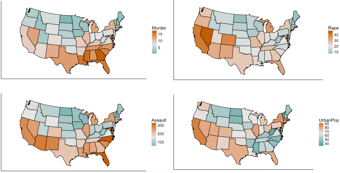
We are using R’s USArrests dataset, a dataset from 1973 showing, for each US state, the:

  1. rate per 100,000 residents of murder
  2. rate per 100,000 residents of rape
  3. rate per 100,000 residents of assault
  4. % of the population that is urban

crime

Now, we will simplify the data into two-variables data. This does not mean that we are eliminating two variables and keeping two; it means that we are replacing the four variables with two brand new ones called “principal components”.

This time we will use R’s princomp function to perform PCA.

Preamble: you will need the stats package.

Step 1: Standardize the data. You may skip this step if you would rather use princomp’s inbuilt standardization tool*.

Step 2: Run pca=princomp(USArrests, cor=TRUE) if your data needs standardizing / princomp(USArrests) if your data is already standardized.

Step 3: Now that R has computed 4 new variables (“principal components”), you can choose the two (or one, or three) principal components with the highest variances.

You can run summary(pca) to do this. The output will look like this:
summarypca

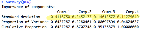
As you can see, principal components 1 and 2 have the highest standard deviation / variance, so we should use them.

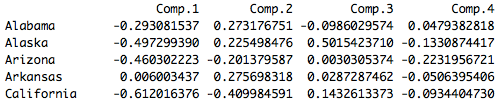
Step 4: Finally, to obtain the actual principal component coordinates (“scores”) for each state, run pca$scores:
score

Step 5: To produce the biplot, a visualization of the principal components against the original variables, run biplot(pca):
biplot

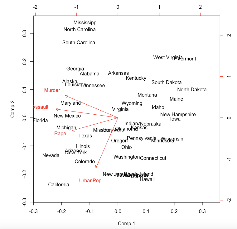
The closeness of the Murder, Assault, Rape arrows indicates that these three types of crime are, intuitively, correlated. There is also some correlation between urbanization and incidence of rape; the urbanization-murder correlation is weaker.

*princomp will turn your data into z-scores (i.e. subtract the mean, then divide by the standard deviation). But in doing so, one is not just standardizing the data, but also rescaling it. I do not see the need to rescale, so I choose to manually translate the data onto a standard range of [0,1] using the equation:

\frac{x_{i}-x_{min}}{x_{max}-x_{min}}

Abbas Keshvani

Advertisement

Daily/monthly/yearly tallies for your data

Say you have a dataset, where each row has a date or time, and something is recorded for that date and time. If each row is a unique date – great! If not, you may have rows with the same date, and you have to combine records for the same date to get a daily tally.

Here is how you can make a daily tally (or a monthly or yearly one; the frequency of tallies is not important):

  1. convert the dates to numbers. R will say 01/01/1970 is day 1, 02/01/1970 is day 2, …, 07/03/2010 is day 14675; 31/12/1960 is day -1.
  2. use a “for loop” to lump entries from the same date together
  3. calculate the daily by calculating the number of rows in the daily lump (I do this below), or by adding all entries in a particular column in a daily lump

To get the daily total,

summary(rott[,2])<-as.numeric(as.Date(rott[,2], format=”%m/%d/%Y”, origin = “3/7/2010″))

daily<-matrix(NA,184,1)

for(i in 1:184) #my data spans 184 days from 7th March to 6th Sept 2010
{
rott.i<-rott[rott[,2]==14674+i,]   daily[i,1]<-nrow(rott.i) #7th March 2010 is the 14675th day from 01/01/1970, the day the R calendar starts
}

acf(daily,main=”Autocorrelation of Timeseries”) #ACF!

Abbas Keshvani

Using ggplot2

American Household Income: the Mean is much higher than the Median
Made on ggplot

I have a standard code for ggplot2 which I use to make line graphs, scatter plots, and histograms.

For lines or scatters:

p<- ggplot(x, aes(x=Year, y=Rank, colour=Uni, group=Uni)) #colour lines by variable Uni #group Uni labelled variables in the same line

Then: 

p + #you get an error if not for this step
geom_line(size=1.2) +
geom_point(data=QS[QS[,2]==”2013″,]) +
geom_text(data=QS[QS[,2]==”2013″&QS[,1]!=”Princeton”,],aes(label=paste(paste(Rank,”.”,sep=””),Uni)),hjust=-0.2)+
ylim(17,0.5) +
scale_x_continuous(limit=c(2004,2014),breaks=seq(2004,2014,1)) +
theme(legend.position=”none”) +
ggtitle(“QS University Rankings 2008-2013”) +
theme(plot.title=element_text(size=rel(1.5))) +
theme_bw() +
theme(panel.grid.major=element_blank(), panel.grid.minor=element_blank()) +
geom_text(aes(label=country),size=6,vjust=-1) +
annotate(“text”,x=2011,y=16.5,label=”Abbas Keshvani”)

For a bar chart:

ggplot(Dist, aes(x=B,y=C,fill=A)) +  #stacked bars, column A contains stacks
geom_bar(stat=”identity”, width=0.9) +

Abbas Keshvani

Types of Data on R

Handling data on R
Handling data on R can be a simple process

There are different types of data on R. I use type here as a technical term, rather than merely a synonym of “variety”.  There are three main types of data:

  1. Numeric: ordinary numbers
  2. Character: not treated as a number, but as a word. You cannot add two characters, even if they appear to be numerical. Characters have “inverted commas” around them.
  3. Date: can be used in time series analysis, like a time series plot.

To diagnose the type of data you’re dealing with, use class()

You can convert data between types. To convert to:

  1. Numeric: as.numerical()
  2. Character: as.character()
  3. Date: as.Date()

Note that to convert a character or numeric to a date, you may need to specify the format of the date:

  • ddmmyyyy: as.Date(x, format=”%d%m%Y”) *default, so format needn’t be specified
  • mmddyyyy: as.Date(x, format=”%m%d%Y”)
  • dd-mm-yyyy: as.Date(x, format=”%d-%m-%Y”)
  • dd/mm/yyyy: as.Date(x, format=”%d/%m/%Y”)
  • if the month is named, like 12February1989: as.Date(x, format=”%d%B%Y”)
  • if the month is short-form named, like 12Feb1989: as.Date(x, format=”%d%b%Y”)
  • if the year is in two digit form, like 12Feb89: as.Date(x, format=”%d%m%y”)
  • if the date in mmyyyy form: as.yearmon(x, format=”%m%Y”) *from zoo package
  • if date includes time, like 21/05/2012 21:20:30: as.Date(x, format=”%d/%m/%Y %H:%M:%S)

Abbas Keshvani