
The Current Account Balance is a measure of a country’s “profitability”. It is the sum of profits (losses) made from trading with other countries, profits (losses) made from investments in other countries, and cash transfers, such as remittances from expatriates.

As the infographic shows, there isn’t much middle ground when it comes to a current account balance. Most countries have:
- large deficits (America, most of Europe, Australia, Brazil, India)
- large surpluses (China, most of Southeast Asia, Northern European countries, Russia, Gulf oil producers).
There are a few countries with
- small deficits (most Central American states, Pakistan)
- small surpluses (most Baltics)
…but they are largely outnumbered by the clear winners and losers of world trade.
The above is not a per-capita infographic, so larger countries tend to be clear winners or losers, while smaller countries are more likely to straddle the divide. Here is the per-capita Current Account Balance map:
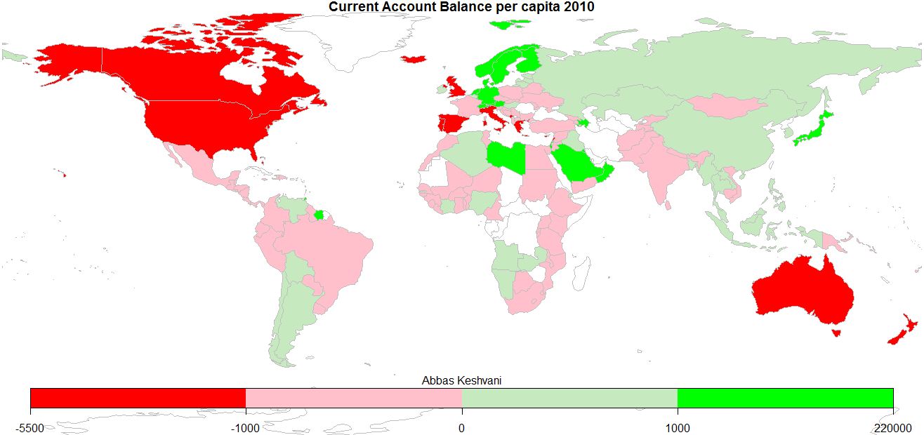
This can be interpreted as how much people around the world earn from eachother:
- Anglophones (people in America, Canada, UK, Australia) chock up some of the biggest deficits, as do people in the Mediterranean
- Oil producers (Saudis, Libyans, Norwegians) profit the most off trade, as do industrious Germans and Japanese. I sense an automobile theme
- Most of us are somewhere in the middle
- Records: Icelanders have the biggest deficits, Singaporeans the biggest surpluses
On the topic of English-speakers running deficits, here is a recent BBC article that explores the link between the English language and the act of saving money.
2010 Current Account Balance and Population data from World Bank; graphics produced on R.
