[This was the top post of the week on the Reddit community dataisbeautiful, where it garnered 1.6 million impressions ]
The US federal government ran a deficit of $1.8 trillion (6.4% of GDP) in 2024. This is expected to increase to 6.7% of GDP in 2025.
Some notable developments in the federal government’s expenditure:
Interest payments have grown to a hefty $890b per year, more than three times what they were a decade ago
Tariff revenue more than doubled to $16b in April 2025, but this barely makes a dent in the overall deficit
Most of the outlays are in social spending (i.e. welfare), military expenditure, and interest payments for previously incurred debt
Breaking down the expenditures explains why it is so difficult to “cut the deficit”: interest servicing and spending on the military and social security are structural costs. It is not a straightforward matter to reduce these outlays. Where the focus tends to be – DOGE touts cuts in areas like weather forecasting and food safety– are generally much smaller areas of expenditure.
*I am calculating net social spend as revenue from employment taxes and unemployment insurance [minus] outlays for income and social security.
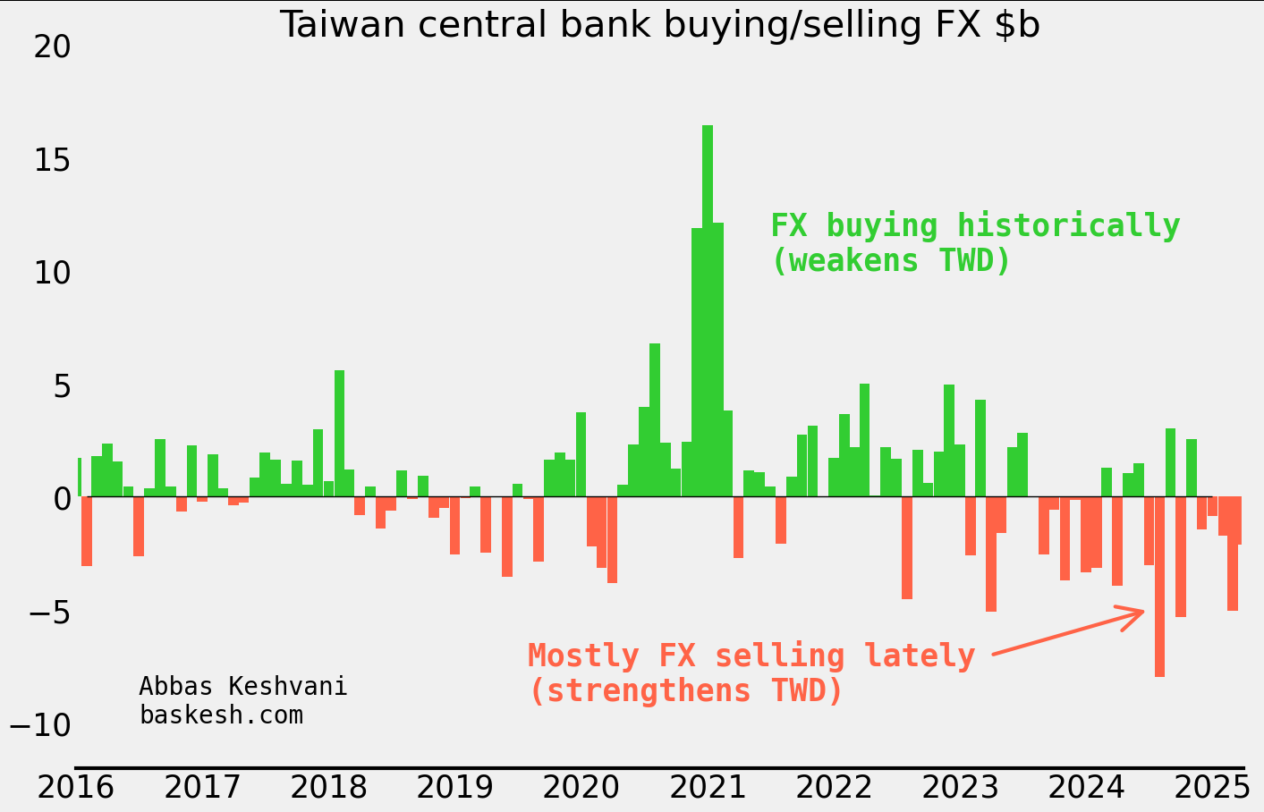
The Taiwanese dollar (TWD) soared as much as 8% this month. This would be a colossal move for any currency, but especially for TWD, which usually moves less than 0.5% daily. Folks have been scrambling to figure out who was responsible for this spectacular rally, from exporters to life insurance companies to the central bank.
It’s the balance of payments, stupid. I type this on a laptop made in Taiwan, contributing to the island’s current account surplus of 14% of its GDP. Such a bounty would ordinarily lead to appreciation of TWD, but much of it is recycled back out by life insurance companies (“lifers”) and the central bank buying foreign assets like US Treasuries. What’s more, exporters tend to retain a lot of their proceeds in foreign currency. Altogether, the trifecta of lifers, exporters, and the central bank have been building up an epic long-dollar position for years.
Central bank started selling dollars. The trifecta holding a floor under USD/TWD began to unravel in 2024. In the first half of the year, the central bank sold $9.1 billion of FX reserves — its biggest sale yet. I estimate that since then, they have picked up the pace of selling even further to an average $2 billion per month into March this year.
My own estimate of the central bank intervention amounts
There were clues… Around the time that the central bank began selling dollars, TWD started trading stronger than my framework1 implied (this is all before the big move recently). This outperformance of TWD indicated that the currency was experiencing a regime shift. There is a lesson here: when one’s framework starts to “break down” it is a sign that something is afoot. This discrepancy from the model foreshadowed the 15 sigma move that we saw in early May 2025.
Lifers and exporters were not the first movers… To be clear, over the period that the central bank was selling dollars, insurers were actually reducing USD/TWD hedges (i.e. selling less dollars) and exporter conversion of FX proceeds had fallen to its lowest ever rate (i.e. selling less dollars). So the CBC was the first mover in the trifecta that had been keeping TWD weak until now.
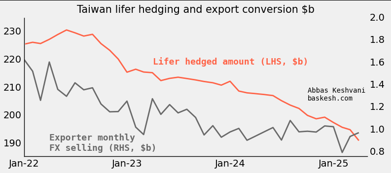
… but they must have piled in. Lifers and exporters had too large a long-dollar position to not take notice of the change at the central bank. Lifers own almost $700 billion in foreign assets, and 60% of this is FX-unhedged. Exporters were holding on to their own mega-pile of dollars. Based on TWD’s historical sensitivity to flows, I estimate that the big move in early May 2025 was enabled by a conversion of around $45 billion going through. There are few parties who can manage such a colossal flow, but lifers and exporters fit the bill.
American scrutiny. So there you have it: the trifecta propping up USD/TWD started unraveling last year when the central bank began selling dollars, leading exporters and lifers to panic-sell dollars this month. But why did the central bank start this? One possible explanation is that they are keen to avoid the ire of the United States, where the Treasury department keep Taiwan on a “monitoring list” of economies whose currency practices merit scrutiny — being on the list is especially hazardous during a trade war. I would have expected the US to give Taiwan a pass, given the latter’s strategic importance, but this is not the first time that Taiwan has reduced FX intervention due to American scrutiny.
Plenty of downside for USD/TWD. Lifers could still sell another $400 billion — around ten times the amount that I estimate went through recently. If expectations for TWD cannot be anchored again, there is plenty of downside for USD/TWD. Until the central bank receives the green light from the US Treasury to buy FX, USD/TWD will be left to the preferences of lifers and exporters. This means that when the dollar is selling off, it will be prone to violent swings.
1In my framework for TWD, I model the currency against historical patterns by key actors including lifers, exporters, and the central bank.
Bonds issued by the US government, known as US Treasuries, sit at the center of the world’s financial constellation. What happens to Treasuries ripples through to every other market: bonds of other countries, stocks, FX, and crypto. Sure the FX market is larger, but the dollar takes its cues from US Treasury yields.
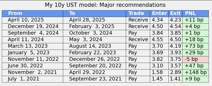
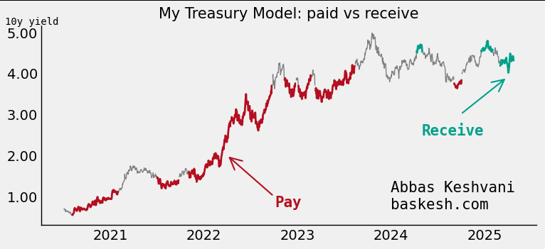
My raison debt. Given the importance of the key 10-year yield, I have modeled it as a function of macroeconomic and financial data (i.e. inflation, issuance at auctions, rainfall in Ohio, etc…). The result is a reliable fair value estimate of the 10y yield, but also a framework to evaluate the importance of new data: yes, the jobs numbers came in weak, but what does that mean for the 10y yield in basis points?
It works. A measure of the model’s success is that it has produced 10 major recommendations in the last four years, and 9 of them have worked, producing over 500 basis points in returns.
The model produced prescient paid recommendations in 2022 (high inflation) and 2023 (SVB), and received recommendations in 2025 (expectations for Fed cuts; still live).
These are just the major recommendations. Each row denotes a period when the model was generally paid or received, but within each period the model may have tactically turned neutral for a short period (i.e. model was neutral for one day during the April 2024 received trade)
How does it work? At the core of the model is a fair value estimate for the 10y yield, itself a blend of key macroeconomic and financial data. Independent variables are smoothed, regressed, and weighted. In addition to that, I apply a valuation filter that dictates the actual execution of the model.
An honest backtest. The above model was trained on 2017-2021 data. I then backtested it out-of-sample from 2021 onwards, and this has produced the >500bp in returns.
Current model recommendation: Receive 10y (yearend forecast of 3.50%). The model lives here.
Following my recent post about the most referenced topic in FX commentary (in my case, excellent daily commentary from BNZ), I received a number of questions from readers about whether topic X was being talked about more or less.
So I visualized the data differently for all those interested – this time as time series. Each chart show the number of references made to a particular topic on a monthly basis.
References to the trade war, Fed and Trump increased in May. Meanwhile references to Covid-19 have been consistently sliding lower every month since March.
See last post for methodology. Everything done on Python.
For all the flak China receives about its greenhouse gas emissions, the average Chinese produces less than a third the amount of CO2 than his American counterpart. It just so happens that there are 1.3 billion Chinese, and 0.3 billion Americans, so China ends up producing more CO2.
Carbon dioxide and other greenhouse gases, such as methane and carbon monoxide, are produced from burning petrol, growing rice, and raising cattle . These greenhouse gases let in sun rays, but do not let out the heat that the rays generate on earth. This results in a greenhouse effect, where global temperatures are purported to be rising as a result of human activities.
The below map shows the per-capita emissions of greenhouse gases:
As you can see, the least damage is done by people in Africa, South Asia, and Latin America. But these places also happen to be the poorest places:…
The Current Account Balance is a measure of a country’s “profitability”. It is the sum of profits (losses) made from trading with other countries, profits (losses) made from investments in other countries, and cash transfers, such as remittances from expatriates.
As the infographic shows, there isn’t much middle ground when it comes to a current account balance. Most countries have:
large deficits (America, most of Europe, Australia, Brazil, India)
large surpluses (China, most of Southeast Asia, Northern European countries, Russia, Gulf oil producers).
There are a few countries with
small deficits (most Central American states, Pakistan)
small surpluses (most Baltics)
…but they are largely outnumbered by the clear winners and losers of world trade.
The above is not a per-capita infographic, so larger countries tend to be clear winners or losers, while smaller countries are more likely to straddle the divide. Here is the per-capita Current Account Balance map: